Introduction
The Sony Xperia 1 II is here, was the wait worth it? Announced back in February, Sony's latest ultimate smartphone is only making it to market now and we've got one to try and establish just how productively Sony has spent these months of final tweaking.
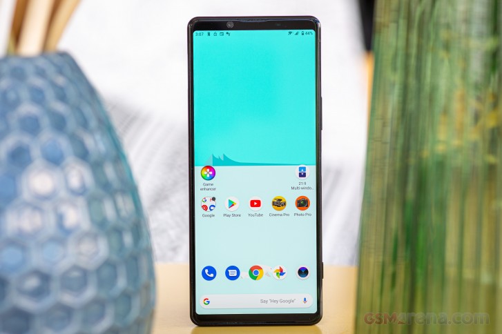
There are a couple of things to get out of the way before we dig deeper. One, while the smartphone is, technically, available in Japan, in Europe and the US, it's still in the pre-order state, with units shipping between mid-June and late-July, depending on where you are and how lucky you get.
Two, it's officially called the Sony Xperia One, Mark Two - don't go calling it the Xperia One-Two, or the One-point-Two, or X1.2 or something along those lines. Sony's bringing the naming convention from its full-frame mirrorless camera lineup to smartphones and generations are marked with an implied 'Mark' and a roman numeral.
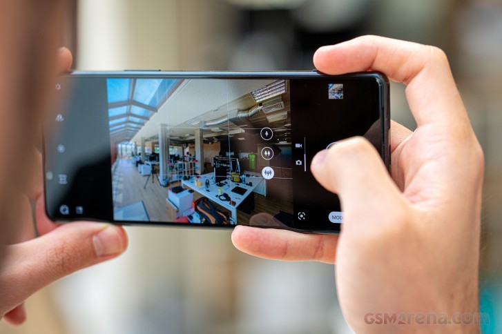
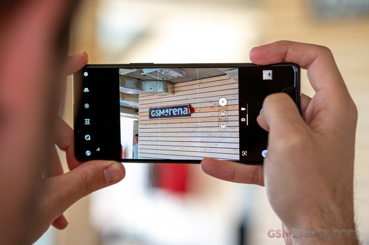
It's not just the naming that comes from the camera division, some actual camera influence is present as well. A standalone Photography Pro app mimics the interface of the A-series ILCs, but underneath the surface you're also getting super fast autofocus, EyeAF for people and pets, 20fps burst shooting and quick sensor readout - just like an A9. Well, almost.
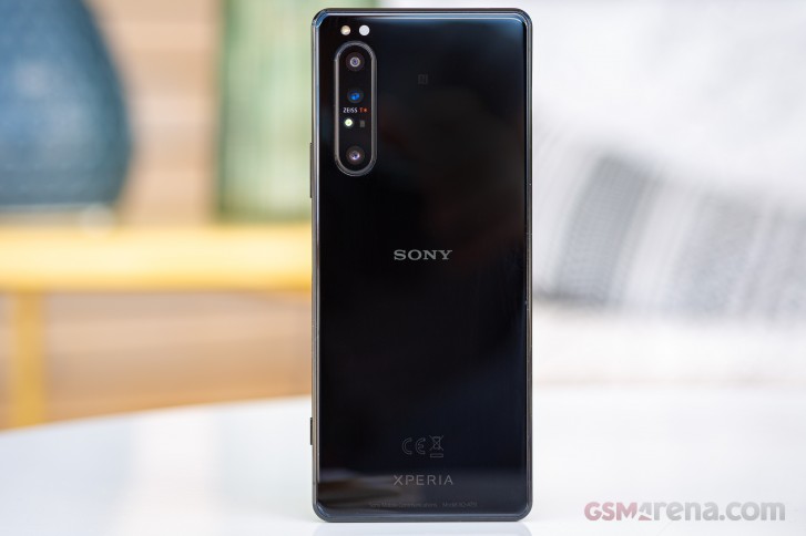
The A9, which the Xperia 1 II aspires to emulate, pairs nicely with a set of 16-35mm, 24-70mm, and 70-200mm lenses - Sony's current take on what's known as the holy trinity in the photographic world. The phone has those too, sort of - it's got a primary camera with a 24mm equivalent focal length, a 16mm ultra wide module, and a telephoto rated at 70mm - all three producing 12MP images. The 'sort of' bit comes from the fact that all the other non-native focal lengths are produced by digital zoom - it's a phone, after all. The A9 doesn't have a selfie cam and Sony hasn't bothered much with the Xperia's either - it's the same 8MP unit from the previous generation. Ahem... Mark I, that is.
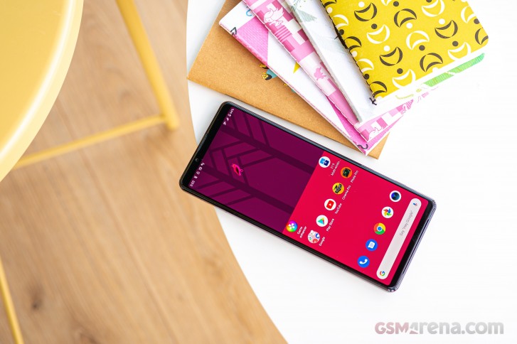
Straight from the Mark I, we have the industry's only 4K display. It's a 6.5-inch OLED with easily more pixels than you'd ever need, wide gamut coverage and a bundle of software adjustment capabilities.
Naturally, the Xperia 1 II packs the latest high-end Snapdragon, and while RAM might be 'just' 8GB, the 256GB of storage is more than plenty (it's the only option, and there's a card slot too). A bump in battery capacity means the 1 II now packs a 4,000mAh cell (up from the 1 I's 3,330mAh) with support for USB PowerDelivery up to 21W and wireless charging - that last bit marking a return from the XZ3. One more thing's back on a Sony flagship too, and that one we thought was gone for good - the 3.5mm headphone jack last seen on the XZ1. Yay!
Sony Xperia 1 II specs
- Body: 165.1x71.1x7.6mm, 184g; Gorilla Glass 6 front and back, aluminum frame; IP65/68 rating; Black and Purple color options.
- Screen: 6.5" OLED, 3840x1644px resolution, 21:9 aspect ratio, 643ppi; 60Hz refresh rate.
- Chipset: Snapdragon 865 (7nm+): Octa-core CPU (1x2.84 GHz Kryo 585 & 3x2.42 GHz Kryo 585 & 4x1.8 GHz Kryo 585); Adreno 650 GPU.
- Memory: 8GB RAM, 256GB built-in UFS 3.0 storage, microSD slot (shared with SIM slot 2).
- OS/Software: Android 10.
- Rear camera: Wide (main): 12MP, 1/1.7" sensor, 1.8µm pixel size, 24mm equiv. focal length, f/1.7 aperture, Dual Pixel PDAF, OIS. Telephoto: 12MP, 1/3.4", 70mm, f/2.4, PDAF, OIS. Ultra wide angle: 12MP, 1/2.55", 1.4µm, 16mm, f/2.2, Dual Pixel PDAF. 4K/60 video recording; 5-axis gyro-EIS.
- Front camera: 8MP, 1/4", 1.12µm, 24mm, f/2.0, fixed focus. 1080p/30fps video recording.
- Battery: 4,000mAh, 21W wired charging support, wireless charging.
- Misc: Capacitive side-mounted fingerprint reader; NFC; stereo loudspeakers; 3.5mm headphone jack.
Sony Xperia 1 II unboxing
The Xperia 1 II arrives in the exact same box as the Xperia 5 from last year (which was differently proportioned from the Xperia 1's) and it's a relatively plain white cardboard package. Inside it, a paper tray holds the phone.
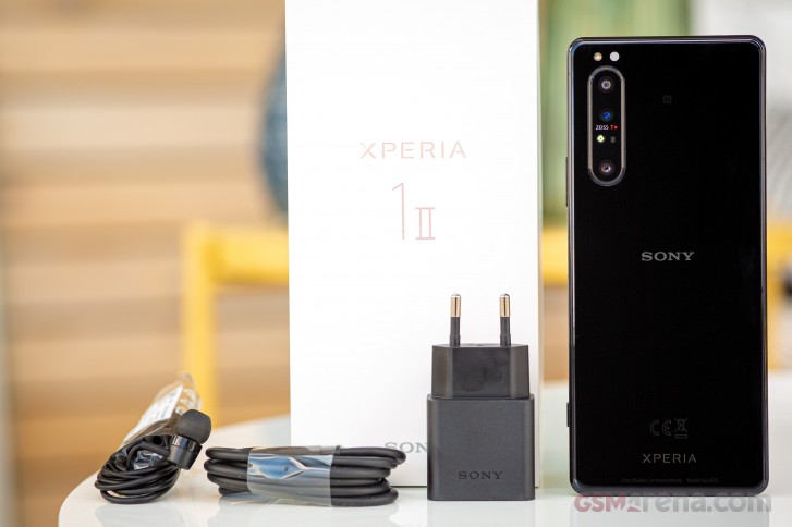
Underneath, a basic set of accessories awaits you. You're getting an 18W USB PowerDelivery adapter (yes, the phone supports 21W PD, but Sony doesn't make such an adapter yet) and a USB-C-to-C cable. A set of earbuds is also included and that's about it.
Design
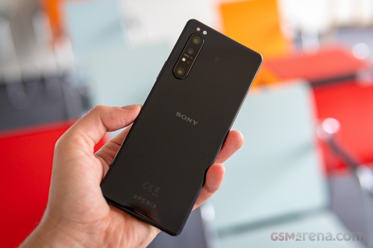
Sony being Sony, the Xperia lineup has been pretty consistent in their designs. The Xperia 1 II continues on Sony's path of defying prevailing trends but still manages to look modern.
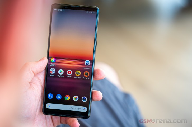
It's a boxy rectangle - the corners are barely rounded and there are no sweeping curves. The completely flat front and back proceed along the technical no-nonsense course.
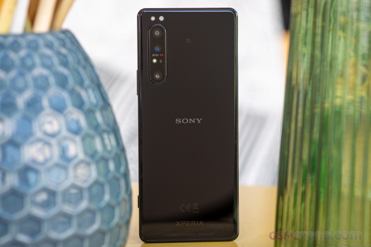
However, the defining design element has to be the exposed flat aluminum frame. In a world of ever shrinking bezels and waterfall displays eating into the frame, the Xperia 1 II offers an alternative. The frame grips nicely despite the glossy finish and lets you easily pick up the handset off a table while also feeling very secure in hand.
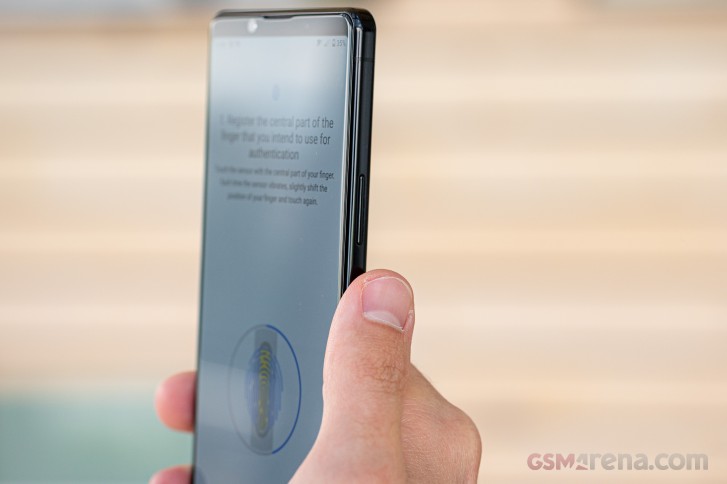
One slight con to this shape is that the frame does tend to show fingerprints more than what your average Galaxy would - there's simply a lot more area to welcome and display finger grease. It's hardly an issue all in itself, particularly since the glass back itself is inevitably going to get smudged up too.
It's made of Gorilla Glass 6, that back panel, and the display too is protected with Corning's latest. The phone is IP68 rated for dust and water resistance as most other current flagships. As is the norm with Sonys, it also covers the IPx5 portion of the standard. So not only should it survive immersion, but also stands a chance against water jets - something rivals don't typically test for (or at least advertise).
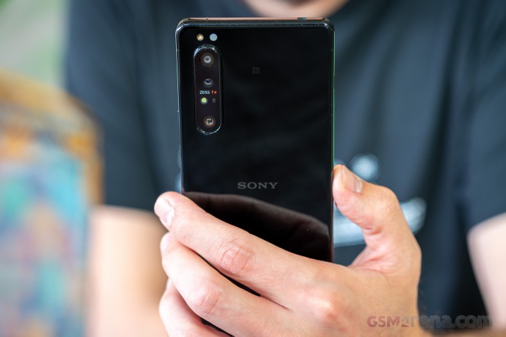
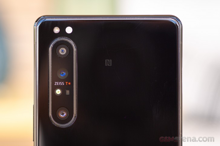
It's a busy camera cluster in the top left corner. Three actual cameras and a 3D ToF emitter-receiver pair are grouped together behind a shared glass that sticks out by a good 1.4mm. Yes, it does make the phone wobble on a table. It still couldn't fit all the camera related bits and the single LED flash and the IR light temperature sensor ended up above the camera bump.
For all the areas you want to keep free of fingerprints, the Xperia 1 II does have a portion of its right side dedicated specifically to fingerprint collection - the capacitive fingerprint reader. In a decisive step in the right direction, it's now housed in the power button, where it should be and where it was on a number of older Xperias. Sony decoupled the two functions in the Xperia 1 and Xperia 5 in order to be able to offer fingerprint recognition in the States, as a patent clash reportedly prevented them from doing so with previous two-in-one designs. All is well now, apparently.
The fingerprint reader/power button is located almost precisely at the midpoint and is easily accessible with either the right thumb or the left index finger. We experienced no appreciable difference in unlock speed or reliability with either hand despite the slightly more awkward left hand action - left hand users shouldn't worry that their fingerprint unlock experience will be compromised.
The volume rocker is above the power button on the same side of the phone and it too clicks nicely.
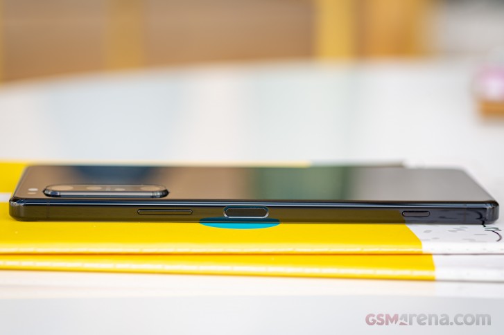
A staple of Sony smartphone design and a key element in the whole 'this smartphone is a camera' concept that the Xperia 1 II adheres to is the two-stage shutter release button towards the bottom end of the Xperia's right side. It has a well-defined half-press position and can also be used to directly launch the camera from standby. Perhaps making it bigger would have added to its usability, though we're also not entirely convinced it's at all needed in the first place.
The opposite side of the phone is home to the card tray only. Sony is one of few holdouts left that allow you to open the tray with a fingernail as opposed to forcing you to use a pin to eject it and we can't say we don't appreciate it. Perhaps an even bigger deal is the fact that the Xperia 1 II doesn't restart when you take out the tray or put it back in as most other Sonys notoriously used to. The tray itself accepts two nano SIMs or a nano SIM and microSD.
In a truly remarkable turn of events, the Xperia 1 II arrives geared with the good old 3.5mm headphone jack. Sony's the first maker to reintroduce the feature on a top-shelf device after removing it on the XZ2 in 2018 as part of one of the dumber industry trends in recent years. It's on the top plate of the phone and we can imagine some people complaining it's not on the bottom, but hey - let's just be happy we have it at all. A mic pinhole keeps the jack company up top.
The USB-C port is on the bottom joined by another mic.
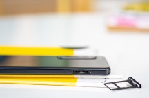
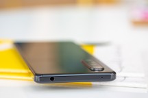

Card tray • Headphone jack up top • USB-C port on the bottom
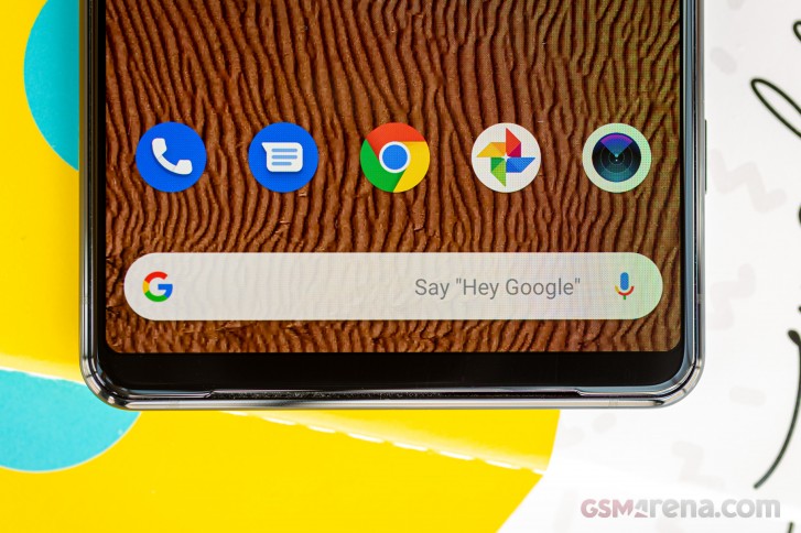
Where are the speakers then? Well, on the front, of course, where they make the most sense. There's a thin slit on each end of the display glass and a speaker fires from both of them. The top one obviously doubles as an earpiece for voice calls. Sony is keen to point out the superiority of such an arrangement to the other approach of a bottom firing main speaker and a front-facing earpiece/second speaker. It's kind of self-evident though, isn't it? The speakers themselves are also supposedly bigger so we can't wait to check them out in our new speaker test.
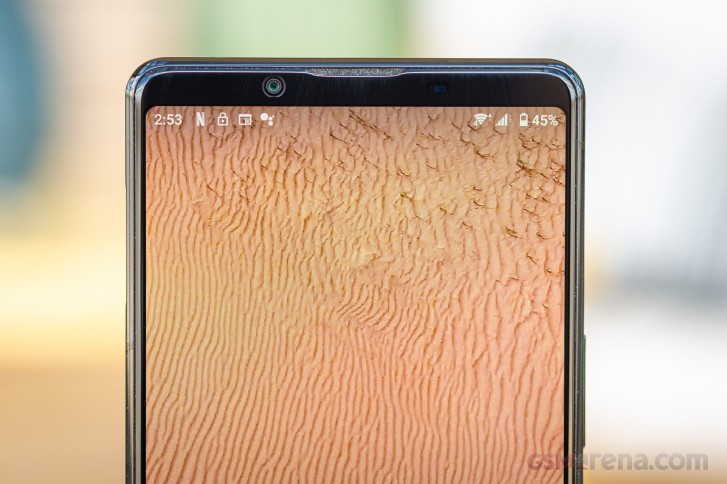
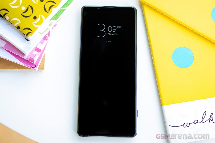
Another thing that will please a certain audience is the presence of an RGB status LED in the top right corner of the phone. A universally available feature back in the day, this little notification light has gone missing on pretty much all high-end phones. Well, the Xperia 1 II has it.
We're circling back to the traditional yet contemporary theme to mention that the Xperia 1 II still has no notch, instead keeping the selfie camera in the top bezel. While that means the Xperia's got more meat above the display than its rivals, it also allows for an uninterrupted viewing area, which is hardly a bad thing. And the 1 II has shaved off a couple of millimeters of height compared to the 1 I, so Sony has indeed made some effort in improving the otherwise mostly unchanged design.
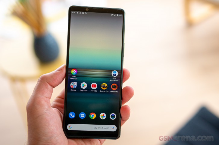
The Xperia 1 II measures 165.1x71.1x7.6mm and it's unquestionably a tall phone - it's 3mm taller than the Galaxy S20+ and less than 2mm shorter than the Ultra. Thanks to a combination of a more elongated aspect ratio, the flat sides, the thinness and relatively low weight, the latest Sony manages to remain feeling compact for a 6.5-inch full-fledged flagship.
4K vs HRR, which is better?
The Sony Xperia 1 II is equipped with a 6.5-inch OLED display and is the only current big-name smartphone with a 4K resolution panel. Its particular flavor of 4K has a 3840x1644px resolution in a 21:9 aspect ratio making for a 643ppi density - the highest by a huge margin.

One major omission on the latest Sony is a high refresh rate which is currently one of the most trendy features when it comes to display specs. The Xperia 1 II remains at 60Hz in a marketplace saturated with 90Hz and 120Hz displays. While the practical benefits of an HRR display are debatable, not to mention some people just can't appreciate the difference, those of us who can and do will find the Xperia lacking in this respect.
Sony does include a Motion blur reduction feature, which they say reduces the time needed for pixels to switch from an off to on state, thus potentially improving the tearing effect on fast moving objects - as per their press materials. We can't say we saw any appreciable difference with the feature turned on and it's certainly in no way a replacement for a high refresh rate panel.
Anyways, we measured a brightness of 333nits on the Xperia 1 II when adjusting the slider manually all the way to the right, with a bump to 540-ish nits under direct light with Adaptive brightness enabled. That's for the Standard display mode, which comes preset out of the box.
Switching to Creator mode, those values got bumped some 10% to 373nits and 600nits respectively. In any case, Sony has apparently dialed back the maximum brightness compared to the previous generation. A bunch of competitors can push out more than 800nits in auto mode with only the P40 Pro and the Motorola Edge+ sill left in the Xperia's ballpark. None of them has the 4K resolution, for what it's worth.
Back on the Xperia 1, the phone would only boost its brightness to the 665nits we have in the table in the proprietary Album and Video apps but not within the testing software. We figured we'd check how that works on the Xperia 1 II, only to discover there are no proprietary Album and Video apps on the Xperia 1 II. Okay then, how about Google Photos? Nope, same values.
| Display test | 100% brightness | ||
| Black, | White, | ||
| 0 | 422 | ∞ | |
| 0 | 607 | ∞ | |
| 0 | 416 | ∞ | |
| 0 | 595 | ∞ | |
| 0 | 464 | ∞ | |
| 0.028 | 683 | 24393:1 | |
| 0 | 415 | ∞ | |
| 0 | 610 | ∞ | |
| 0 | 379 | ∞ | |
| 0 | 797 | ∞ | |
| 0 | 536 | ∞ | |
| 0 | 871 | ∞ | |
| 0 | 518 | ∞ | |
| 0 | 850 | ∞ | |
| 0 | 510 | ∞ | |
| 0 | 858 | ∞ | |
| 0 | 425 | ∞ | |
| 0 | 531 | ∞ | |
| 0 | 538 | ∞ | |
| 0 | 888 | ∞ | |
| 0 | 518 | ∞ | |
| 0 | 848 | ∞ | |
| 0 | 511 | ∞ | |
| 0 | 622 | ∞ | |
We touched upon Standard and Creator modes and let's try and clarify what's what. Creator mode is the one that is designed for a wide color gamut and should faithfully reproduce content in the BT.2020 color space. It's the mode you want for displaying HDR videos too.
Standard mode, the default one out of the box, is more frivolous with colors and will expand the color gamut of otherwise plain content to make for a more vivid reproduction. There's an 'Auto Creator mode' option for Standard mode, which will engage Creator mode when it detects an app that should best be viewed that way such as Netflix. You can't just pick any app, the phone will offer you a selection of apps it deems Creator mode worthy.
That's one level of color settings, but there's another one. Outside of the two main modes, you also get a White balance menu, where you can pick between Warm, Medium and Cool settings, a Custom slider with white point adjustment between 5000K and 9300K, as well as separate RGB sliders.
The white point adjustment is not really intended for regular use. Most users will be happy with the default setting, Sony has added the other options for professional users who will like to match the screen's white point to that of their professional printer so they can see how graphics or photos look before printing.
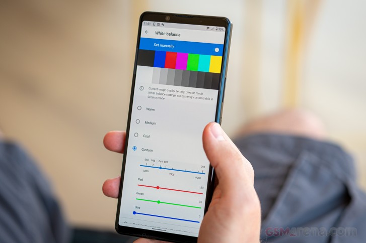
In our testing, Creator mode returned an average deltaE of 6.0 with purplish whites some 9 units off the mark when examining DCI-P3 swatches - not great. We couldn't quite get the advertised BT.2020 compliance either, our test swatches returning an average deltaE of 8.0.
We're happy to share that Creator mode with white point set at the D61 gave us very accurate results for our sRGB test sequence - an average deltaE of 2.0 and spot-on whites.
Our best shot at the DCI-P3 color space came from Standard mode, D61, where we got an average deltaE of 3.0 and once again very accurate white point.
So if you are after absolute color accuracy, you are free to choose your preferred Display mode based on the color space your content comes in.
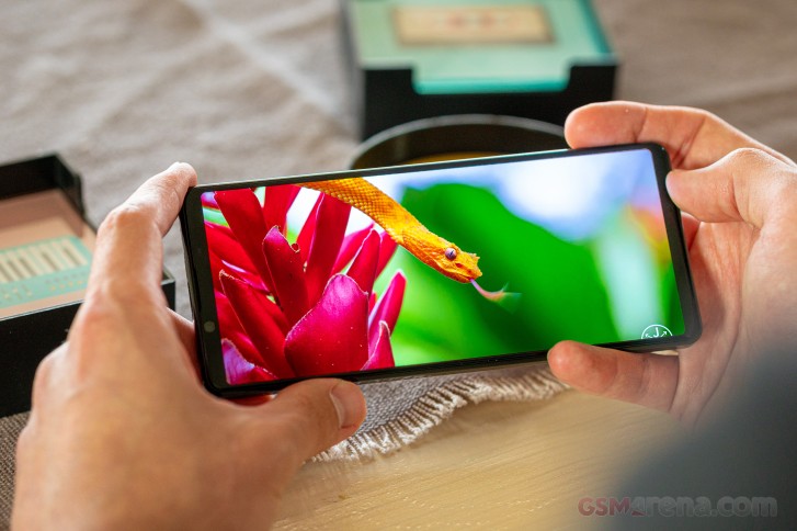
We were able to play HDR content from all major sources like Netflix, Amazon Prime Video and YouTube. Netflix in particular served HDR10 but was capped at 1080p, and we were expecting 4K. We did get the UHD resolution on the Xperia 1 back when we reviewed it, though it's limited to FullHD now as well.
As for Amazon Prime, that remained in 720p.
YouTube, on the other hand, could go all the way up to 4K60, though the phone continued to report it's rendering in 2560x1096px. Odd. It's not inconceivable that all of these peculiarities get addressed a firmware update or app updates from the respective vendors in time for the actual market launch. We'll be sure to check and update you if there are new developments on this front.
Sony Xperia 1 II battery life
The Sony Xperia 1 II has gotten a battery upgrade compared to the previous generation. Even so, with a 4,000mAh powerpack inside it's on the low end of the spectrum on today's flagship scene. The Huawei P40 Pro is the next lowest capacity at 4,200mAh, the Find X2 Pro's battery is marginally bigger at 4,260mAh, while the Mi 10 Pro and OnePlus 8 Pro are in the 4,500mAh ballpark. Admittedly, most of these have bigger displays, high-refresh rate too, though the Xperia does have the highest resolution.
Sadly, we were unable to test the Xperia 1 II's battery life at this point in time. Sony informed us that the currently available firmware isn't entirely final when it comes to battery management so the results we'd be getting wouldn't be indicative of the ones on the shipping product. Once the final firmware is made available in the coming days or weeks, battery life will be the first thing we test and we'll update this page accordingly.
The Xperia 1 II supports USB PowerDelivery up to 21W but it ships with an 18W charger in the box. It's then not among the quickest to top up and we clocked 1:51h from flat to full - the better ones in the business do it in around one hour, the best ones are under 40 minutes.
Starting from an empty battery we got to a 46% charge in half an hour, more or less the same number as other phones with 4,000mAh batteries and 18W charging. For what it's worth, the Xperia is quicker than the Motorola Edge+.
With a third-party PD adapter capable of outputting up to 65 watts, we measured 53% in half an hour and 1:44h for a full charge. It's a minor improvement, so the lack of a 21W adapter in the Xperia 1 II's box or Sony's portfolio is hardly a big deal.
The Xperia 1 II supports wireless charging too, a return of the feature from the XZ3 which was removed from the Xperia 1 for one reason or another. It's certified for compliance with the Qi Extended Power Profile for up to 11W of power transfer.
Sony itself makes the WCH20 charging pad which we saw all the way back in XZ2 times and it outputs 9W. It's kinda old and pretty hard to come by if you want to purchase one, not to mention pricey. Third-party is the way to go with wireless chargers.
As usual, the Xperia 1 II comes with Sony's Battery care feature. It aims to minimize the time your battery spends above 90% charge, a state which could be detrimental to its health in the long run. It does so by learning your charging habits and only topping it up immediately before you need the phone. It works best with overnight charging and a well-established daily (nightly) routine, obviously, though you could set a custom time frame yourself. Sony's research says that by employing this procedure on the Xperia 1 II it would take twice as long for the battery capacity to degrade down to 80% of the original value when this feature is used regularly.


Battery care
Speaker test
The Sony Xperia 1 II has a stereo speaker system that's one better than competing efforts, Sony insists. The reason for the claim is that both speakers are directed towards the viewer as opposed to the prevailing downward-firing/front-firing combos, and thus achieve a more balanced reproduction. Allegedly, the speakers are now larger too, so it should make a difference in sound quality.
One peculiarity with the Xperia 1 II is that the top speaker is always the left channel and the bottom speaker is always the right channel. Rotating the phone in landscape the other way around won't make it switch. The thing is, though, the Xperia has a correct side up determined by the placement of the shutter release button. You shouldn't be holding it upside down, you know.
In its out of the box state, the Xperia 1 II posted a Good score for loudness in our speaker test. Switching on the Dolby Atmos feature (to its default Dynamic mode), we got improved readings for our 7-track test suite and a Very good result for loudness.
Neither mode has much thump in the low register, but we can say with confidence that with Dolby Atmos enabled we got a livelier reproduction of the mid and high tones and an overall wider soundstage.
Use the Playback controls to listen to the phone sample recordings (best use headphones). We measure the average loudness of the speakers in LUFS. A lower absolute value means a louder sound. A look at the frequency response chart will tell you how far off the ideal "0db" flat line is the reproduction of the bass, treble, and mid frequencies. You can add more phones to compare how they differ. The scores and ratings are not comparable with our older loudspeaker test. Learn more about how we test here.
The Xperia 1 II has that Dynamic vibration system feature that's meant to enhance the perception of bass by actuating the vibration motor in tune with the sound output. Much like on previous instances, we didn't feel like it added much to the experience - you just don't experience sound with your fingertips. If anything, it's more irritating than pleasant.
Audio output quality
We've recently discontinued our audio output quality test.
The reason for that is that most phones that arrived for testing were already excellent in this regard and whatever difference there was, it was marginal and probably indistinguishable to anything but our lab equipment.
Stock Android 10, some Sony enhancements
The Xperia 1 II runs Android 10 in what is a further stripped down version than the already pretty vanilla one we saw on the Xperia 1 and 5 last year. The two new additions coming natively with Android 10 are obviously present on the Xperia 1 II - the two-tiered location permission and system wide Dark theme.


Location permission • Dark theme
Weirdly enough, the Xperia comes out of the box with the old-school three button nav bar for navigation, though it does offer you the option for gesture navigation. The pill-based method that the previous-gen Xperias used and is still available on Pixels is not an option on the 1 II.
Fingerprint unlock is the only biometric unlock method available and since we found that to work flawlessly we're not lamenting the lack of face unlock. Seeing how there's no dedicated face recognition hardware, a face unlock feature would be less secure than the fingerprint reader anyway.


Navigation options • Back sensitivity • Biometrics security
The UI basics are identical to what you'd get on Google's own phones.


Lockscreen • Homescreen • Folder view • App drawer • Task switcher • Quick toggles
There are unique Xperia bits on top, however. One-handed mode, for example, lets you shrink the UI to one corner by double-tapping the home button to bring everything within reach. The thing is though, it only works when you have the nav bar as your navigation option as there's really no home button as such to double tap on with the gesture-based navigation.
Sony's Side Sense is present as well. A pair of touch-sensitive areas on either side of the phone enable various actions most of which user-configurable. One particularly powerful and customizable option is the 21:9 pair shortcut feature. Through it, you simply select two apps and the relative location you want to launch them in and then you can trigger a split-screen with the pair instantly. Oh, and one-handed mode is available from here as well, so it does work without a nav bar, sortof.


One-handed mode • Side sense • Side sense options • Side sense menu
Gone is the Album app - Sony's in-house gallery, and with it the image editor. This functionality has been delegated to the Google Photos app now, and that's hardly an issue. The Music app still remains, though with ubiquitous streaming apps taking over from offline playback we think its days are probably numbered too.
The one other major bit of custom software on the Xperia 1 II is Game Enhancer and it's gotten some improvements over the previous generation. It still has two main interfaces, that's been kept - one acts as a game launcher, while the other is an overlay that can be pulled out while in game.


Game Enhancer, launcher app
It now lets you pick between three performance profiles, on a per-game basis as before. One is "Performance preferred", there's a "Battery life preferred" on the opposite end with a 40fps cap, and a "Balanced" profile in the middle. A new feature is the so called H.S. power control - when you're gaming and the phone is plugged in the charger, it won't actually charge the battery but will only essentially meet your current power consumption. The rationale is to limit the heat generation - H.S. stands for Heat Suppression.
The Focus settings is an array of toggles that let you disable pesky notifications, turn off adaptive brightness, disable the camera button and the side sense functionality - basically limit distractions.
There are also screenshot and video capture features, the latter of which can also capture footage from your selfie camera along with the game, as well as sound from your microphone. Volume level adjustments are provided. There is no direct streaming to any video platforms, though. Last, but not least, a quick search function can bring up YouTube videos in a floating video for you, related to the game you are currently playing.


Game Enhancer, in-game features
Synthetic benchmarks
It'll come as no surprise that the Sony Xperia 1 II is powered by the Snapdragon 865 - as are all of this year's global Android flagships. A single RAM and storage version exists, to the best of our knowledge, and it's 8GB of RAM and 256GB of UFS 3.0 storage.
Sony's tuned the Xperia 1 II conservatively and it consistently posts middle-of-the-pack results in benchmarks. Single-core results in GFXBench are very tightly spaced between Snapdragon 865 devices, with the Kirin-equipped P40 Pro trailing them. It's a similar story in the multi-core test only the Huawei is staying closer.
GeekBench 5.1 (single-core)
Higher is better
- Apple iPhone 11 Pro
1333 - nubia Red Magic 5G
929 - vivo iQOO 3 5G
928 - Motorola Edge+
910 - LG V60 ThinQ 5G (new run)
910 - Oppo Find X2 Pro (60Hz, 1440p)
906 - Xiaomi Mi 10 Pro 5G
905 - OnePlus 8 Pro (120Hz, 1440p)
902 - Oppo Find X2 Pro (120Hz, 1440p)
900 - Sony Xperia 1 II
897 - Galaxy S20+ (120Hz, 1080p)
886 - Huawei P40 Pro
780 - Sony Xperia 1
747
GeekBench 5.1 (multi-core)
Higher is better
- Apple iPhone 11 Pro
3466 - vivo iQOO 3 5G
3402 - nubia Red Magic 5G
3387 - OnePlus 8 Pro (120Hz, 1440p)
3374 - Oppo Find X2 Pro (60Hz, 1440p)
3349 - Xiaomi Mi 10 Pro 5G
3331 - Sony Xperia 1 II
3318 - Motorola Edge+
3295 - LG V60 ThinQ 5G (new run)
3289 - Oppo Find X2 Pro (120Hz, 1440p)
3269 - Huawei P40 Pro
3197 - Sony Xperia 1
2753 - Galaxy S20+ (120Hz, 1080p)
2703
The gaps between flagships are wider in Antutu, where the Xperia 1 II inches ahead of the LG V60 but is bested by pretty much all S865 competitors. The P40 Pro and the Exynos-powered Galaxy S20+ do end up behind the Sony in this one.
AnTuTu 8
Higher is better
- Xiaomi Mi 10 Pro 5G
595246 - Oppo Find X2 Pro (120Hz, 1440p)
593717 - Oppo Find X2 Pro (60Hz, 1440p)
585764 - vivo iQOO 3 5G
575601 - Motorola Edge+
574155 - OnePlus 8 Pro (120Hz, 1440p)
573276 - nubia Red Magic 5G
557056 - Sony Xperia 1 II
534701 - LG V60 ThinQ 5G (new run)
527612 - Galaxy S20+ (120Hz, 1080p)
500114 - Huawei P40 Pro
496356 - Galaxy S20+ (60Hz, 1440p)
489371 - Sony Xperia 1
418206
Moving on to graphics-only benchmarks, the Xperia 1 II posts comparable scores to competitors in GFXBench. Offscreen results are virtually identical while in the onscreen tests the Sony scores an odd frame per second lower than other 1080p+ devices - it too runs at 1080p+ it's just that there are a few more pixels along the tall side.
GFX 3.1 Manhattan (1080p offscreen)
Higher is better
- Apple iPhone 11 Pro
118 - Motorola Edge+
89 - Oppo Find X2 Pro (120Hz, 1440p)
87 - OnePlus 8 Pro (120Hz, 1440p)
86 - Xiaomi Mi 10 Pro 5G
86 - LG V60 ThinQ 5G (new run)
86 - Oppo Find X2 Pro (60Hz, 1440p)
86 - nubia Red Magic 5G
86 - vivo iQOO 3 5G
86 - Galaxy S20+ (120Hz, 1080p)
85 - Galaxy S20+ (60Hz, 1440p)
85 - Sony Xperia 1 II
84 - Huawei P40 Pro
75 - Sony Xperia 1
71
GFX 3.1 Manhattan (onscreen)
Higher is better
- Motorola Edge+
83 - Galaxy S20+ (120Hz, 1080p)
75 - Xiaomi Mi 10 Pro 5G
75 - vivo iQOO 3 5G
61 - Apple iPhone 11 Pro
60 - Sony Xperia 1 II
59 - LG V60 ThinQ 5G (new run)
59 - nubia Red Magic 5G
59 - Sony Xperia 1
55 - Huawei P40 Pro
52 - Galaxy S20+ (60Hz, 1440p)
43 - OnePlus 8 Pro (120Hz, 1440p)
43 - Oppo Find X2 Pro (120Hz, 1440p)
43 - Oppo Find X2 Pro (60Hz, 1440p)
43
GFX 3.1 Car scene (1080p offscreen)
Higher is better
- Apple iPhone 11 Pro
66 - Motorola Edge+
52 - Sony Xperia 1 II
51 - Galaxy S20+ (60Hz, 1440p)
51 - OnePlus 8 Pro (120Hz, 1440p)
51 - LG V60 ThinQ 5G (new run)
51 - Oppo Find X2 Pro (120Hz, 1440p)
51 - Oppo Find X2 Pro (60Hz, 1440p)
51 - nubia Red Magic 5G
51 - vivo iQOO 3 5G
51 - Galaxy S20+ (120Hz, 1080p)
50 - Xiaomi Mi 10 Pro 5G
50 - Huawei P40 Pro
44 - Sony Xperia 1
42
GFX 3.1 Car scene (onscreen)
Higher is better
- Apple iPhone 11 Pro
57 - Motorola Edge+
48 - LG V60 ThinQ 5G (new run)
44 - Galaxy S20+ (120Hz, 1080p)
42 - Xiaomi Mi 10 Pro 5G
42 - vivo iQOO 3 5G
42 - nubia Red Magic 5G
41 - Sony Xperia 1 II
39 - Sony Xperia 1
33 - Huawei P40 Pro
31 - Galaxy S20+ (60Hz, 1440p)
25 - Oppo Find X2 Pro (120Hz, 1440p)
25 - OnePlus 8 Pro (120Hz, 1440p)
24 - Oppo Find X2 Pro (60Hz, 1440p)
24
Aztek OpenGL ES 3.1 High (onscreen)
Higher is better
- Motorola Edge+
33 - Galaxy S20+ (120Hz, 1080p)
32 - Xiaomi Mi 10 Pro 5G
29 - vivo iQOO 3 5G
29 - Sony Xperia 1 II
27 - Galaxy S20+ (60Hz, 1440p)
19 - Oppo Find X2 Pro (120Hz, 1440p)
18 - OnePlus 8 Pro (120Hz, 1440p)
17 - Oppo Find X2 Pro (60Hz, 1440p)
17
The one more pronounced difference is in Vulkan-based Aztek test where the Xperia is noticeable behind other 1080p-rendering rivals.
Aztek Vulkan High (onscreen)
Higher is better
- Motorola Edge+
32 - Xiaomi Mi 10 Pro 5G
29 - vivo iQOO 3 5G
28 - Galaxy S20+ (120Hz, 1080p)
26 - Sony Xperia 1 II
20 - OnePlus 8 Pro (120Hz, 1440p)
17 - Oppo Find X2 Pro (120Hz, 1440p)
17 - Oppo Find X2 Pro (60Hz, 1440p)
17 - Galaxy S20+ (60Hz, 1440p)
14
That Vulkan disadvantage shows in 3DMark too - the Xperia does manage to outpace the P40 Pro, but is bested by everyone else. In the OpenGL test things are back to normal.
3DMark SSE Vulkan 1440p
Higher is better
- nubia Red Magic 5G
6678 - vivo iQOO 3 5G
6675 - Motorola Edge+
6666 - Oppo Find X2 Pro (60Hz, 1440p)
6586 - Oppo Find X2 Pro (120Hz, 1440p)
6526 - OnePlus 8 Pro (120Hz, 1440p)
6425 - Galaxy S20+ (120Hz, 1080p)
6354 - Galaxy S20+ (60Hz, 1440p)
6311 - Sony Xperia 1 II
6167 - Huawei P40 Pro
5637 - Sony Xperia 1
4505
3DMark SSE OpenGL ES 3.1 1440p
Higher is better
- Motorola Edge+
7409 - vivo iQOO 3 5G
7261 - nubia Red Magic 5G
7250 - Oppo Find X2 Pro (120Hz, 1440p)
7159 - Oppo Find X2 Pro (60Hz, 1440p)
7143 - Sony Xperia 1 II
7138 - OnePlus 8 Pro (120Hz, 1440p)
7127 - Galaxy S20+ (120Hz, 1080p)
6819 - Galaxy S20+ (60Hz, 1440p)
6735 - Huawei P40 Pro
6062 - Sony Xperia 1
5123
The Xperia 1 II posts predictable results across all common benchmarks, in tune with the rivals of the day, save for a small disadvantage in Vulkan based tests. The phone does tend to heat up after prolonged testing - it's not the worst offender, but it's not negligible either. Some thermal throttling shows after repeated benchmarks runs but it doesn't result in significant drops in performance.
Speed, speed, speed
The Sony Xperia 1 II is big on camera hardware and features with a lot of inspiration drawn from the company's A9 series of mirrorless cameras. The main theme there is speed, and speed is what the Xperia's camera has been optimized for.
Sensor readout speed in particular is what motivated Sony to pick a slightly smaller conventional sensor for the Xperia 1 II's main cam as opposed to the 108MP units some competitors are opting for. According to the press materials, they can get a full sensor readout from their imager in 10ms, as opposed to the 30ms required to get a 12MP shot from the 108MP modules, or the 100ms for 108MP capture. Fast sensor readout means reduced rolling shutter with moving subjects and, more quantifiably, a 20fps burst shooting speed.
Now, when we're saying smaller, we don't mean small. The Xperia 1 II's main cam has a properly big 12MP 1/1.7" sensor with 1.8µm pixels - a significant step up from the Xperia 1's 1/2.6" imager with a 1.4µm pixel pitch. Even so, it is smaller than what you can get on a Galaxy S20 Ultra or a Mi 10 Pro (1/1.33"), though similar to the one in the non-ultra Galaxy S20s' main cams.
Sony calls it a Dual Photo Diode Sensor which rings like Dual Pixel but then they go on to detail that it uses 247 focus points with a 70% frame coverage, as opposed to every pixel being used for phase detection, and we're not entirely certain how to interpret the two statements.
In any case the Xperia1 II has more focusing aids, so the dual-pixel-or-not conundrum's importance fades. From a hardware perspective the phone has a 3D ToF camera with a 43200pt resolution. It works at distances up to 5m and feeds data into the AI algorithms helping them determine what is the actual subject so the phone can focus on that regardless of where it's positioned in the frame.
The autofocus calculations are performed up to 60 times each second, meaning those 20fps bursts should be able to give you consistently sharp results - and with proper exposure, too.
Straight from the mirrorless Alphas comes Real-time Eye AF too, for humans and animals alike.
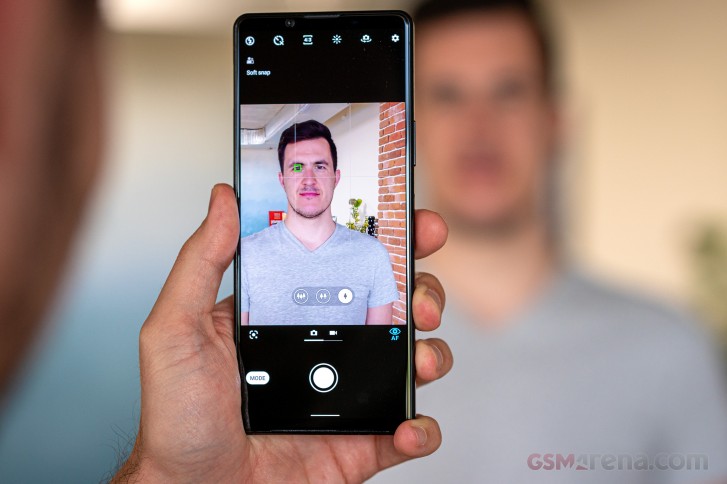
Sony has chosen the focal lengths of its three main cameras so that they match the short end of the company's Holy trinity of mirrorless camera lenses the 16-35mm, 24-70mm, and 70-200mm - staples in most pro photographers' camera bags.
The main cam has a 24mm equivalent lens with an f/1.7 aperture and features optical image stabilization. The ultra wide cam's 16mm equivalent lens has an f/2.2 aperture while the telephoto is specified at 70mm focal length equivalent and has an f/2.4 aperture. You do get the option for intermediate zoom levels, but they come by digitally zooming in from the nearest wider angle cam - so the 50mm equivalent, for example, is captured by the main 24mm cam with no input from the others.
The ultra wide angle cam has a 12MP 1/2.55" sensor with 1.4µm pixels - formerly flagship main cam numbers. This too is a Dual Photo Diode sensor so this camera has phase detection autofocus as well - we're liking this ongoing trend for autofocusing ultra wides.
The telephoto cam with the 70mm equivalent focal length is having us a bit confused. The phone reports it's using the Samsung S5K3T2 sensor for this one and that's a 1/3.4" 20MP imager, while the Xperia creates 12MP photos with all of its cameras, telephoto included. Samsung makes this one with either a conventional Bayer RGB filter array or a Tetracell (or Quad Bayer) one and we're thinking Sony got the RGB one and is cropping from its center while having a natively shorter lens. We can't be entirely certain of it, of course. The lens is stabilized, that much is clear.
All lenses have Zeiss T* coating, which should help manage flaring handsomly.
Over at the front, nothing's really changed from a hardware perspective when comparing with the previous generation. The selfie camera is the same 8MP unit with a 24mm equivalent lens with an f/2.0 aperture and fixed focus.
A whole bunch of camera apps
The Xperia 1 II has no less than three camera apps pre-installed. There's the plain Camera app that's best for casual snaps and no-fuss video recording. Then there's the Cinema(tography) Pro app we're familiar with from the previous Xperia 1, for when you want to get creative with your video capture. Brand new this year is the Photo(graphy) Pro app that tries to bring the best of the experience from the mirrorless camera lineup to the smartphone.
The basic Camera app is almost the same as on previous Sonys with a small but notable tweak - the camera selector now adopts the widely used tree designation with three trees for the ultra wide, two trees for the main cam a single tree for telephoto. Whether it's trees or a 0.7x-1x-3x designation is immaterial, but what's important is that the selector now gives you direct access to each cam as opposed to cycling through them like it did on the previous Xperia.
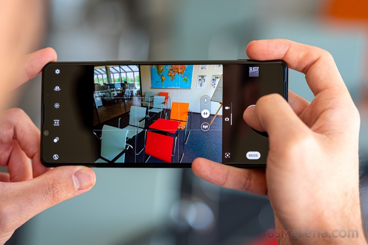
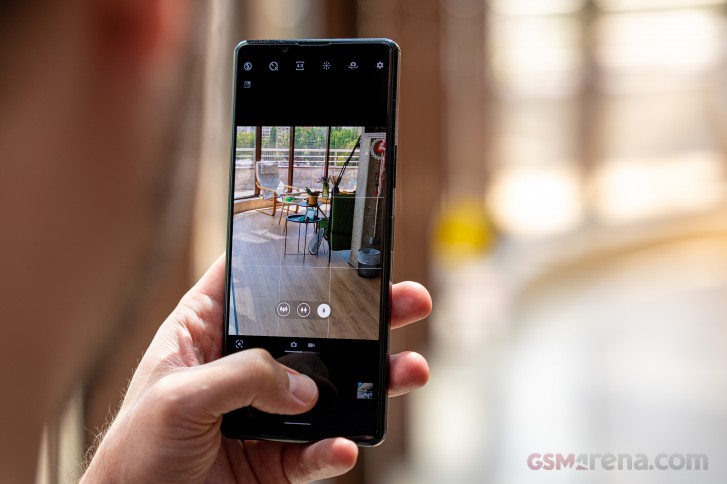
Side swipes switch between stills and video, while swiping down (but not up) toggles between front and rear cams. The far end of the viewfinder has controls for flash, bokeh mode, aspect ratio, implicit white balance and exposure compensation adjustment, an extra toggle for switching between front and rear cams and a cog wheel to take you to settings.
A Mode button in the vicinity of the shutter release gives access to extra modes like Panorama, and Creative effect (a.k.a. filters) and the last mode you pick from here gets promoted to a sticky position for quick access from the viewfinder. There is no Manual mode on the Xperia 1 II.


Camera app
There is the Photography Pro app, however, and that's better than a Manual mode. Accessible from the extra modes button in the plain app or straight from its own icon on the homescreen, Photo Pro offers a powerful interface with plenty of manual controls.
Let's first mention that the overly prominent EV compensation dial is overly prominent even for people who use EV on a regular basis, plus having analog-looking dials in a touch-operated interface is a bit dated as a concept. Then again, Sony's mirrorless cameras aren't known for their touch operation.
The other bit we're conflicted about is the shutter release button operation, which is the default way to take a picture in Photo Pro - the alternative is by using the volume buttons. The point we're trying to make is that there's no touch-based way to take a photo.
The dedicated button itself does have a well-defined half press and a reasonable full press action, but pressing a tiny button that requires some force to trigger while holding a flat glossy rectangle means shake. It's inconsequential in bright daylight, but for any remotely longer exposure, it's a recipe for blurred images. It's simply a vastly different combination of grip, button placement, force of actuation and whatnot when compared to an actual camera and what works there doesn't necessarily work here.
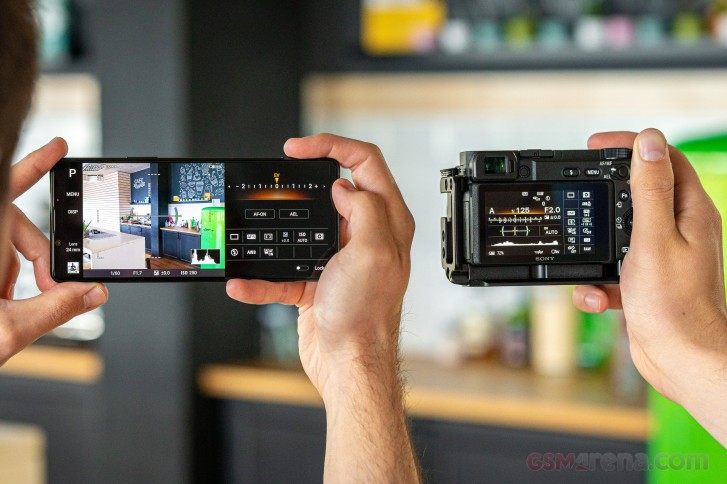
That's most of what bad we have to say about Photo Pro though. Anyone who's picked up a Sony mirrorless camera before will feel right at home. The icons are the same, the viewfinder displays are similar and the menu is, if anything, a lot better.


Photo Pro interface
You get more controls than your average Manual mode too. A Drive mode selector lets you pick between single shot, continuous high speed and and continuous low speed burst modes and 3s or 10s self timers. Mind you, the self timer option is missing when shooting with the rear cameras in the vanilla Camera app.
Single and continuous AF modes are available as well as manual focus (slider is a bit tiny) and you can pick between a wide area for AF or just the center. A metering mode selector offers the usual spot, center-weighted and matrix metering (Multi in Sony speak) options.
The white balance menu has 5 presets for common light types, and three memory banks for custom presets. You can set the custom white balance by either pointing at a gray card and pressing the set button, or adjusting it manually along the Green-Magenta and Amber-Blue axes in the white balance grid. That's some powerful white balancing right there.
An ISO selector is also provided and adjustment is possible within a 64-3200 range for the main cam, 25-1000 for the telephoto and 50-1600 for the ultra wide.
The viewfinder itself provides information for the current exposure parameters and offers optional histogram and level overlays. Status readings in the top left corner let you know the storage location (phone or microSD card), remaining storage space, resolution and whether geotagging is enabled.
To the left of the viewfinder there's a mode indicator (the P in our case) which turns into a dial once pressed and lets you pick between full Auto, Program, Shutter priority and Manual mode. There's no Aperture priority mode, on grounds of all the lenses being fixed aperture, obviously.
The Disp(-lay) button cycles through the various viewfinder overlay modes but even the busiest (with the histogram and level and all the status icons) isn't too busy, so it's no problem leaving everything on.
The lens indicator turns into a lens selector when pressed, which is one step too many - it's quicker than physically switching lenses on a camera, of course, but when not having to actually do it, why not have all three immediately accessible? To zoom in between the fixed levels, you need to tap the little arrow and then rotate the dial - it looks cools, but isn't the most functional interface. The volume rocker can be set to operate within these zoom levels, but it can't switch cams either - another missed opportunity.


Photo Pro zooming
The Settings menu benefits from the large screen and is a lot easier to understand than the often unintelligible abbreviated options in the actual Sony cameras menus. Of course, this here is a phone with just a handful of camera settings, while the dedicated cameras have screens upon screens of options, so there's that too.
Most of the settings in the menu you'll find around the viewfinder anyway, but one is only available here. DRO/Auto HDR lets you choose between Sony's Dynamic Range Optimizer that tries to fit a high-contrast scene's dynamic range within a single exposure by adjusting the tone curve. The Auto HDR option is the more advanced approach, uses multiple exposure stacking, and produces more useful results.


Photo Pro settings
As for the the video-only Cinema Pro app, we did a a detailed review on that one a year ago, and we will probably take the new version for a spin too.
The new features in this iteration include 25fps recording, an optional level for making sure you're holding the phone horizontally, fewer steps to access project files, the ability to record in 2560x1080px at 120fps, and the intelligent wind filter (also available on the regular Camera app).
The fundamentals that make Cinema Pro that much more useful for an advanced user remain the same. The highlights include shooting at a cinematic 23.98 or 25 fps at 21:9 resolutions of either 3840 x 1640 or 2520 x 1080. It records in HLG HDR and uses the h.265 codec. ISO is adjustable from 50/64/25 (depending on camera module) to 800 and shutter speed can be set by shutter angles. Fine tuning of white balance along the Green-Magenta and Amber-Blue axes is available and you can also set it using a gray card.
Manual control of focus is naturally available too and it includes options for focus racking to precise pre-set distances with the ability to set the speed as well.
You can additionally overlay different frame lines (for 4:3, 2:1, 2.39:1, or 16:9) as well as a rule-of-thirds-grid.


Cinema Pro app UI
The Look selector lets you pick from professional color profiles for your video. These include VENICE CS, Opaque/BU60 YE60, Bright/BU20 YE60, Warm/YE80, String/BU100, Cool/BU60, Soft/YE40 and Soft Monochrome. Of those, Venice CS is the flattest one with soft colors, the least amount of contrast and soft tonal transitions. It should lend itself well to color grading in post-processing.
Daylight image quality
The Xperia 1 II captures really nice photos with its main cam in broad daylight. It has deep vibrant colors that remain true to life. Fine detail is well resolved and foliage maintains a natural look without the overprocessed results characteristic of some competitors (cough, Samsung). Noise is very well controlled too, though the images aren't quite as squeaky clean as, well, Samsungs'.


Daylight samples, main cam, default Camera app
The Xperia's full auto settings aren't overly eager to dabble HDR and do produce images with a contrastier look without the wide dynamic range of most other high-end phones in certain difficult scenes like the snail above. You will get it under the right circumstances, only the right circumstances are fewer in the Xperia's mind than you may want. This approach may please purists but we do think that bumping up the aggressiveness of the Sony default algorithms by a notch wouldn't hurt.


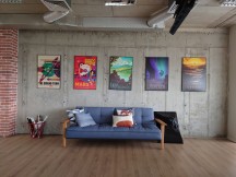


Daylight samples, main cam, default Camera app
You can sort of get that in Photo Pro with the DRO/Auto HDR setting in the Auto HDR state. The flipside to those recovered highlights is a visible loss of contrast, saturation, and sharpness. We can't help but think that some rivals let you have your cake and eat it in this respect in a way that the Xperia misses slightly.


Daylight samples, main cam, Photo Pro app, Auto HDR
We did shoot two scenes specifically with the intent to compare the four different 'modes' and the full auto from the vanilla Camera app was a close match for the Auto HDR shot, yet very similar to the DRO image in the other scene. We'd then conclude than the Camera will do just fine in most scenarios, but if you'd rather have guarantees that you'd retain your highlights, shoot Auto HDR in Photo Pro. Going for DRO doesn't offer the convenience or ease of use of the default Camera app and it doesn't bring meaningful benefits in terms of dynamic range, but you can use it if it makes you feel good.
What you probably don't want to be doing at all, ever, is leaving the DRO/Auto HDR to its off state. That is, unless you absolutely insist on getting images with a 2014 look in terms of dynamic range.


HDR comparison, main cam: Camera app • Photo Pro Auto HDR • Photo Pro DRO • Photo Pro HDR off
The ultra wide's images are a close match in terms of overall rendition, which is nice. That includes colors, but also dynamic range and that's no small feat. It's not quite there when it comes to noise performance and looking up close reveals a bit more of it, but detail levels remain exemplary for an ultra wide camera. High contrast edges will exhibit some color fringing, however, and those you might spot without pixel peeping in the more extreme of cases.


Daylight samples, ultra wide cam, default Camera app
The ultra wide camera of the Xperia 1 II has autofocus and that lets you get close to subjects and still capture sharp images while getting that exaggerated perspective. Using it for actual closeups isn't the best idea, particularly if said subjects are insects.


Daylight samples, ultra wide cam, default Camera app
Shooting in Photo Pro in Auto HDR will give you the same relative difference in results as observed on the main cam. Once again, the visible desaturation and loss of contrast aren't dealbreakers and the improved dynamic range is appreciated, but it's somehow not our favorite balance.


Daylight samples, ultra wide cam, Photo Pro app, Auto HDR
Software distortion correction is available for the ultra wide angle images giving you the familiar tradeoff between wider coverage and straight lines around the edges. We're leaning heavily towards the corrected option for regular shooting, though the bulging edges could be a look you may want on occasion.


Distortion correction: On • Off • On • Off
The discovery that the Xperia 1 II's telephoto camera isn't quite what it's advertised to be had us slightly annoyed - why is it specified as a 12MP one if it uses a 20MP sensor? Then again, it's not the first offender of this sort, with OnePlus and Xiaomi coming to mind, and then there's Samsung with their 64MP 28-ish mm 'telephoto' camera on the S20s. So anything goes, as long as it takes nice images.
Well, the Xperia is neither here nor there. Its shots have a dreamy soft look to them particularly with distant subjects which is more than a little ironic. It could be a deficiency in the phone's ability to acquire precise focus over long distances or it could be that the lens just isn't as sharp when used on faraway subjects, but nearby shots did end up sharper in our experience. Color reproduction is generally in keeping with the other two and dynamic range is excellent for a small-sensor telephoto.




Daylight samples, telephoto cam, default Camera app
Auto HDR doesn't bring surprises - some loss of contrast and color, boosted midtones - okay, not great.




Daylight samples, telephoto cam, Photo Pro app, Auto HDR
Sony's claim that the Xperia's lenses can be used as the trio of pro zooms in the photography world sounds great as a wish, but isn't quite applicable in practice, particularly when it comes to zooming further than the 'native' 70mm of the tele cam. We shot a couple of scenes at the 70, 135 and 200mm equivalents - or what is roughly 3x, 5x and 8x zoom. As similar efforts have proven before, the digitally zoomed in shots can look decent at fit to screen magnifications and are well usable for sharing online, but don't stand up well to pixel level scrutiny. The Xperia does deserve a nod, for not attempting to go beyond that 200mm equivalent.


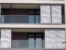


Zoom: 70mm • 135mm • 200mm • 70mm • 135mm • 200mm
Low-light image quality
In low light, the Xperia turns in what can best be described as not immediately likeable, but ultimately very competent performance. Let's elaborate.
Its main camera output using the Camera app (urgh!) is sharp and excellently detailed while noise is kept to a minimum. Color saturation doesn't suffer one bit either. What might put you off at first is the high-ish contast that could leave the tonal extremes underdeveloped - deep shadows, or blown out point light sources. A case could be made that it's the more faithful reproduction, but faithful isn't necessarily what we're striving for here. The good news is that while the blown highlights are forever gone, the shadows do stand up well to some boosting in post processing.


Low-light samples, main cam, default Camera app
If you don't want to bother with that, Photo Pro with Auto HDR enabled is your best bet for better tonal development straight out of the phone. This not-strictly-Night-mode-but-kinda-Night-mode approach does take a few extra moments to capture an image - not that we clocked it, but it's relatively quick at, say, 2 seconds and - and gives you that boost in the shadows and darker mid-tones. It does little for the highlights, so what's clipped is not recoverable, and a side effect is some added softness when compared to the auto-auto shots. But still, these are very good low-light photos coming from a phone.


Low-light samples, main cam, Photo Pro app, Auto HDR
We're including comparison shots taken in DRO mode and ones with all of HDR turned off for completeness' sake, but we can't really endorse shooting in either of these modes in low light.


HDR comparison, main cam: Camera app • Photo Pro Auto HDR • Photo Pro DRO • Photo Pro HDR off
The ultra wide angle cam of the Xperia manages to live up to that high standard, for the most part, unless you completely starve it for light. Give it some, and it'll return reasonably high-quality shots - detailed, well exposed, and with good color saturation.





Low-light samples, ultra wide cam, default Camera app
Auto HDR seems more detrimental in this case than it helps. While it will produce the expected tonal bumps, the detail penalty is more visible here and the noise in the shadows becomes an issue. We found that a simple nudge of the shadows slider on the vanilla cam's image in your favorite editing software is more beneficial. Sometimes you just need to put in the extra work. It makes you wonder why Sony hasn't optimized that a bit more.


Low-light samples, ultra wide cam, Photo Pro app, Auto HDR
In low light, when you engage the telephoto camera, the The Xperia 1 II always uses that. There are no light thresholds below which it'll default to the main one and that's an honest approach to low-light telephoto-ing that we appreciate.
What we also appreciate are the sharp and detailed shots we're getting. Often hitting its ISO1000 ceiling it still manages to keep noise low and maintain color saturation. Quite the showing.


Low-light samples, telephoto cam, default Camera app
Once again, the Photo Pro app with Auto HDR engaged and everything left to auto isn't on the same level. Naturally, with a proper setup (read tripod or another form of stabilization) you'll likely be able to get superior results with the added creative control. Not hand-held in auto, though.


Low-light samples, telephoto cam, Photo Pro app, Auto HDR
Portrait mode
Portrait mode is accessed from an icon in the viewfinder - not immediately obvious, but always in plain sight when you learn where it is. It does a fairly good job with subject separation on humans though an occasional glitch around the shoulders did seep through in our samples.
That's not the Xperia's main portrait issue, however - dynamic range is. There's apparently zero HDR action going on in these shots, and while the subject does get exposed well, whatever moderately bright areas you have in the frame end up blown out.


Portrait samples
The Xperia handles non-humans in its portrait mode just fine, and can even isolate fairly complex subjects like the tree crown in the first sample below. Even so, with the right color combos it can get fooled along simple straight borders - the top edge of the street sign. Again, no HDR, bad.


Portrait samples, non-human subjects
Selfies
Yes, yes, the Xperia 1 II has the same 8MP selfie cam with no autofocus - no improvement there. Ah, but it's a nice selfie cam that takes pleasing pictures nonetheless. The selfies are detailed and have accurate skin tones, though dynamic range is a bit on the narrow side - again that's how the Sony tends to process its shots across the board.


Selfie samples
Selfie portraits are a hit and miss affair with an inclination towards miss. The concept of a 'subject' is fairly general in the Xperia's book and you may often end up with blurred portions of your cheeks or have bits in the background remain unaffected by the blur. Not ideal.


Selfie portraits
Video quality
Using its default Camera app, the Xperia 1 II can record video up to 4K with each of its three cams, though it doesn't support 4K60. 1080p does offer the option for 30fps and 60fps frame rates. You get to choose between the h.264 and h.265 codecs for 4K video, while 1080p is encoded using the h.264 only. There's an HDR mode too, again on all three cams, and that one is in h.265 only. A ton more options are available if you go for the Cinema Pro app (and if you know what you're doing).
Footage out of the Xperia's main cam is very good in 4K (55Mbps bit rate). Dynamic range is wide, yet the clips are contrasty and not washed out. Fine detail is abundant and there's a natural look to the processing. Colors are great also - vivid, but not overly so, no weird casts.
1080p at 30fps (17Mbps) is about as detailed as they come and mostly maintains the color and dynamic range properties of 4K footage. It does have an extra level of sharpening taking away a bit of that natural goodness we liked so much about the 4K. 1080p at 60fps means some loss of finer detail, but remains very similar otherwise.
The 16mm cam continues along those lines and captures well detailed 4K footage with likable colors and wide dynamic range - the lighting change made it extra difficult too. 1080p30 is similarly very good, but the 60fps footage has a noticeably jaggy interlaced look.
The tele camera's 4K clips are visibly soft though they do maintain pleasing colors and fairly good dynamic range. 1080p30 leaves little to complain and loses the 4K's hazy look for a noticeably sharper one. 1080p60 comes with small detail penalty, but remains usable.
Stabilization is available in all major modes on all three cameras. Sony makes a differentiation between Optical SteadyShot and plain SteadyShot in its camera specifications, but that's only to account for the lack of OIS on the 16mm cam - in essence all three cams have EIS, the 24mm and 70mm one also have OIS.
Stabilization is excellent on the 16mm and 24mm cams in both 4K30 and 1080p30 modes with ironed out walking shake and smooth natural pans. The 1080p60 mode on both cams is a bit more jittery but still alright. The 70mm cam is more prone to shake by virtue of the longer lens, and the phone doesn't manage to smooth things out in software all too well. Its handhled footage is usable, but shake remains clearly visible.
We do intentionally aim to pick the time for recording our video samples to coincide with quiet weather, but we also shot a couple of samples specifically to try out the Intelligent wind filter. The first clip below has the feature turned off to give you an idea of the weather conditions, and it's engaged for the second video. The difference is indeed dramatic. Mind you, all of the above samples were recorded with the wind filter on.
Competition
The Xperia 1 II isn't yet available outside of Japan, but pre-orders will be opening any day in the US at what's reportedly going to be a $1,200 retail price while the same number only in Euro is listed on several retailers' websites in Europe already. That's steep, though the pair of wireless noise-canceling headphones offered to those who pre-order makes it a better deal. That's not guaranteed to be universal though, and we'll be treating it as a $1,200/€1200 phone. That's a tough crowd.
In Europe, €1200 gets you a Galaxy S20 Ultra and that has its advantages over the Xperia. A 120Hz display is among those as is the faster charging. The Ultra's telephoto has more reach than the Xperia's, if that's your thing, though we'd call an overall camera comparison between the two a draw (with a nod to the Galaxy for selfie capabilities). The Xperia counters with a headphone jack and compactness that the Ultra doesn't remotely aspire to.
The S20+ is what you can get for Xperia money in the States, while in the EU, it comes cheaper. That one mostly matches the Xperia for size and weight, so the pocketability argument goes out the door. The Xperia remains your choice if you want to drive older wired headphones, while the Galaxy can be your door to the realm of HRR displays.
Seems unusual, but in the US, the Motorola Edge+ is a viable flagship Android alternative to the Sony - the Edge+ makes little sense to an EU buyer, but at $1000 it compares nicely to the Xperia. The Moto has class-leading battery life, which, let's face it, we're not expecting from the low-capacity high-res Sony. The Edge+'s 90Hz dual curved display is a different type of sight to behold than the Sony's and could be your thing. Both have the 3.5mm jack which is a real treat in 2020, but the Edge+ does come with some concessions - like no proper IP rating and a camera system that's not quite up there with the best.
Available globally, the OnePlus 8 Pro comes in some $300/€300 cheaper than the Xperia. The OP8P has the 120Hz display going for it but the Xperia counters with a headphone jack and microSD slot. All in all, the Xperia edges ahead in camera too. Were they at the same price, we'd go for the Sony, but the OP is the better value proposition here.
If you're into saving some but still getting a great camera experience, the Huawei P40 Pro could make a case for attempting life without Google services for €800. It is heavier and bulkier too, but has a 90Hz display, great battery life (faster charging too) and awesome cameras that are at least a match for the Sony's. The ToF-aided selfie cam offers 3D face unlock, but also 4K recording and AF - the Xperia's front-facing cam is nowhere as capable. The Huawei has no 3.5mm jack, but does offer an IR emitter should you have some legacy devices to control.




Samsung Galaxy S20 Ultra 5G • Samsung Galaxy S20+ • Motorola Edge+ • OnePlus 8 Pro • Huawei P40 Pro
Verdict
Sony's smartphone sales have dwindled to less than half a million units in the last quarter, and we can't imagine a $1,200/€1200 all-out flagship model released some good 4+ months after its announcement is going to move that into the tens of millions. But we also doubt it was ever the original intent.
The Xperia 1 II is more of a showcase of how Sony sees the ultimate Android smartphone, without much regard for what others are doing. HRR displays? Nah, we'll do 4K resolution. 65W charging? 21W is good enough - with Battery Care included. Night mode? Nah, here's a Manual mode on steroids in this Photo Pro app.
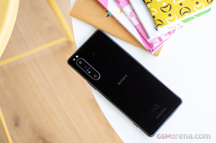
What we're saying is that the Xperia 1 II isn't great value at its projected retail price, and that prevents it from getting an all-out recommendation. What it is, on the other hand, is a great phone for Sony fans or for anyone else with a money-is-no-object attitude looking for one of the best camera systems in a smartphone. Imagine they had released it in March.
Pros
- Technical, no-nonsense design, the flat frame is great for handling too.
- Headphone jack, stereo speakers, wireless charging, IP68 rating, microSD card, all in the same device - they don't make them like this anymore.
- Stock Android experience at its best.
- Versatile camera system for stills and video, in good and low light alike.
- Powerful proprietary software for photo and video capture, easy-to-use default app.
Cons
- Display not as bright as key competitors, the 4K resolution has little practical benefit.
- Charging is slower than most.
- No 4K60 video recording in the native app.
- Selfie cam has limited DR, no AF and no 4K recording.
tinyurlis.gdv.gdv.htclck.ruulvis.netshrtco.detny.im
مقالات مشابه
- بحرانزده مسکن وزیر کشد نهایی دریافت به-خارج-از-زندان-رایگان کارت by گفت کامینگز ایده
- شرکت صادرات و واردات کالاهای مختلف از جمله کاشی و سرامیک و ارائه دهنده خدمات ترانزیت و بارگیری دریایی و ریلی و ترخیص کالا برای کشورهای مختلف از جمله روسیه و کشورهای حوزه cis و سایر نقاط جهان - بازرگانی علی قانعی
- Prime 10 کلید راه طرفداران استفاده برای اسباب بازی
- چیزهایی که باید درباره خرید میوه خشک بدانید
- موتورولا سوئیچ آن موضع و وعده های اصلی سیستم عامل آندروید به روز رسانی برای لبه+
- شرکت صادرات و واردات کالاهای مختلف از جمله کاشی و سرامیک و ارائه دهنده خدمات ترانزیت و بارگیری دریایی و ریلی و ترخیص کالا برای کشورهای مختلف از جمله روسیه و کشورهای حوزه cis و سایر نقاط جهان - بازرگانی علی قانعی
- شرکت صادرات و واردات کالاهای مختلف از جمله کاشی و سرامیک و ارائه دهنده خدمات ترانزیت و بارگیری دریایی و ریلی و ترخیص کالا برای کشورهای مختلف از جمله روسیه و کشورهای حوزه cis و سایر نقاط جهان - بازرگانی علی قانعی
- Netflix بکشد می افزاید: "صفحه قفل" ویژگی برای جلوگیری از اتفاقی مکث
- Redmi Earbuds S نقد و بررسی
- این است جنبه بیش از حد مواد شیمیایی به ندرت دیده میشود، اما این چرا لازم است