Samsung Galaxy S20 Ultra long-term review
Introduction
Oh look, this is one Galaxy S20 that has Ultra in the name! And it also comes with an Ultra price! But is it all-around Ultra enough to really, truly justify those things? That's a very good question, one which we'll try to answer for you in this long-term review.
This year Samsung wasn't content to go with its usual two-size approach to its flagship S smartphone line (with an "e" or "lite" - or both - thrown in for good measure from time to time). Instead, it went ahead and created the quintessential "everything and the kitchen sink" device in the appropriately named S20 Ultra. A phone that misses absolutely nothing you'd want in a high-end handset in this day and age. Or... does it? Could it actually have some weird compromises hiding underneath that shiny Ultra branding?
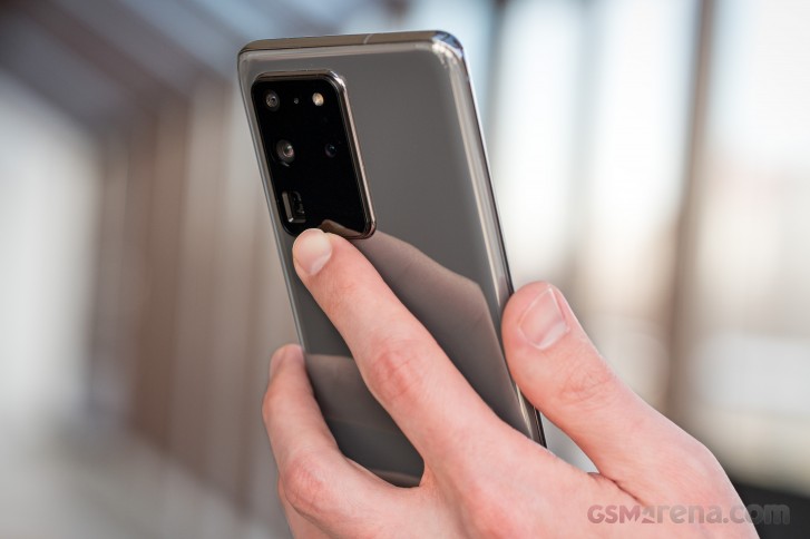
We've spent weeks on end using the Galaxy S20 Ultra exclusively, in order to bring you an image of what it's like to live with, that is as accurate as possible, if inherently subjective. Without spoiling anything, we can say that yes, it's a premium experience undoubtedly, but things aren't always perfect and neither is the S20 Ultra. No phone has ever been, but this one got us hopeful, based on what it brings to the table on paper.
To find out what we liked about it during our extensive usage period and what we weren't so thrilled about, join us on the next few pages as we explore Samsung's still-current (but not for long) top dog smartphone in depth. Note that we have the Exynos-powered model, so that will obviously influence our opinions. The Snapdragon version seems to offer slightly better performance and better battery life, according to the internet at large. We can't vouch for this as we haven't had that model in to compare to.
Design
The Galaxy S20 Ultra is big, there are no two ways about that. It's not one of those smartphones that will just 'disappear' in your pocket, no matter how big said pocket happens to be. You'll always feel it's there, and the same goes for when it's in your hand. It's big (on all axes), it's heavy, and it's unashamedly both. It has a presence, it makes an impression, that's for sure.
Interestingly enough, it doesn't have any crazy color versions, at least not yet - those may come later in a bid to rejigger interest in it. As of now, you can pick between gray and black and white and all of these hues are incredibly boring. Very fitting in a boring office space - sure. But also, not in any way evoking any excitement every time you happen to be glancing at the thing you just spent a big chunk of money to purchase.
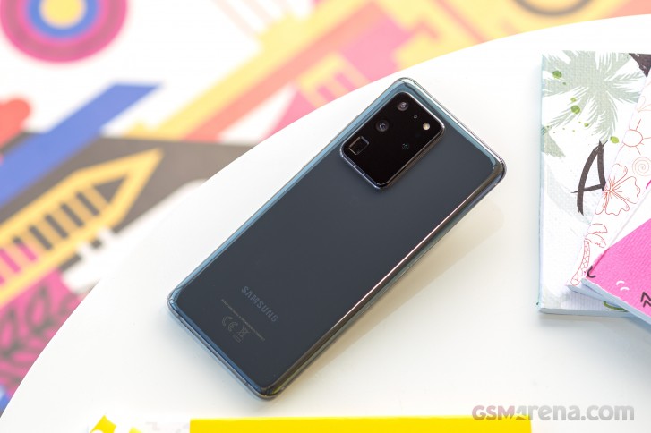
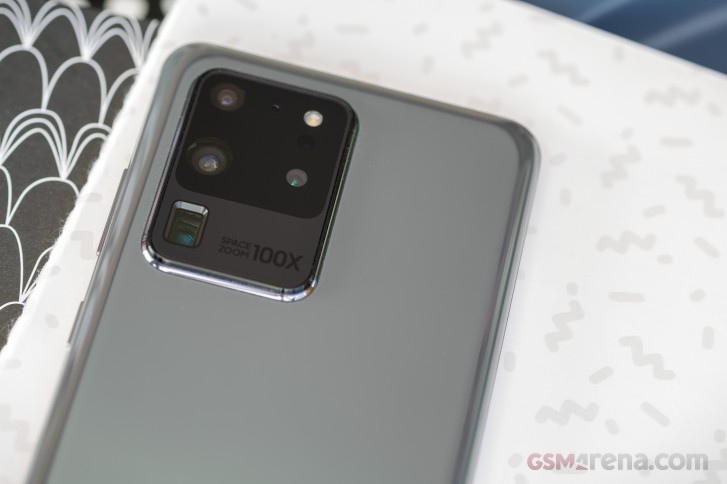
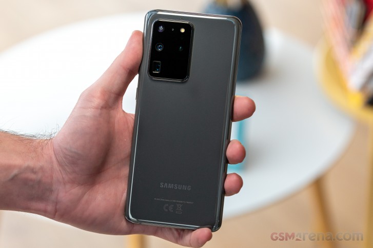
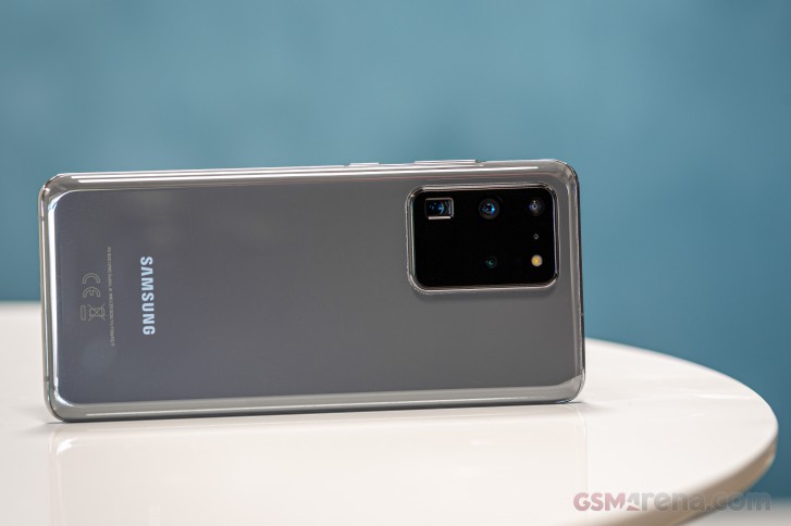
And this theme is continued with the huge and incredibly ugly camera island at the back.
To add insult to injury, the marketing department then decided it had to plaster the words "100X Space Zoom" onto the island.
That makes it somehow even more tacky than it already was based on just looks alone. This is not great, but hey, at least you won't be looking at the back of your phone too much, will you? And of course you yourself may be absolutely thrilled with the bland colors and unsightly camera bump, all of the above is subjective on our part, and we're not trying to hide that. Fun fact: because it's so huge, the phone barely wobbles when sat on a table - the only time you'll get that is when you touch the upper parts of the screen. Typing is pretty much wobble-free.
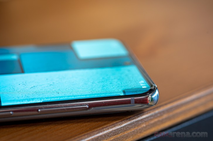
Otherwise, the S20 Ultra is the usual glass sandwich design, albeit with a weirdly shaped metal frame. If you look at the sides of the phone, the frame isn't centered, sitting neatly exactly in the middle between the two sheets of glass, instead it's much closer to the screen.
This probably has something to do with the fact that the display glass curves much less towards the sides than it used to on the phone's predecessors. Many people like this because many people misunderstand why the experience of using a Samsung phone with a more curved screen isn't ideal. It has nothing to do with the curves themselves, and everything to do with Samsung's software, which has always been - and continues to be - terribly bad at rejecting accidental touches from that area.
We're not knocking Samsung for no reason here - this year, along with the S20 Ultra, this reviewer has used the Huawei P40 Pro, the Xiaomi Mi 10 Pro, and the Oppo Find X2 - all with curved screens and almost no accidental touch issues. One would pop up every few days or so. On the S20 Ultra, on the other hand, it happened dozens of times each day.
The good news is that there is a solution to this - just use a case. We went for the one that's included in the box, you may invest in one that feels less cheap to the touch, but the point here still stands. It's crazy how bad Samsung, maker of most of the curved screens found on other phones, is at the accidental touch thing.
It seems like the company itself just couldn't find any other solution, than to make the curves lesser on the S20 family. And yes, that helps, but it's such a not-subtle solution, to a problem that a lot of competitors are fixing simply with smarter software. Or, in some cases, even more extreme ideas - the vivo NEX 3 has a 'waterfall' screen, for example, and yet you will not have any such problems on it, because the touch layer is simply deactivated on the 'waterfall' part. Despite the way it may seem just by looking at pictures of that display curvature, that phone is actually much nicer to use than the S20 Ultra, from this one perspective.
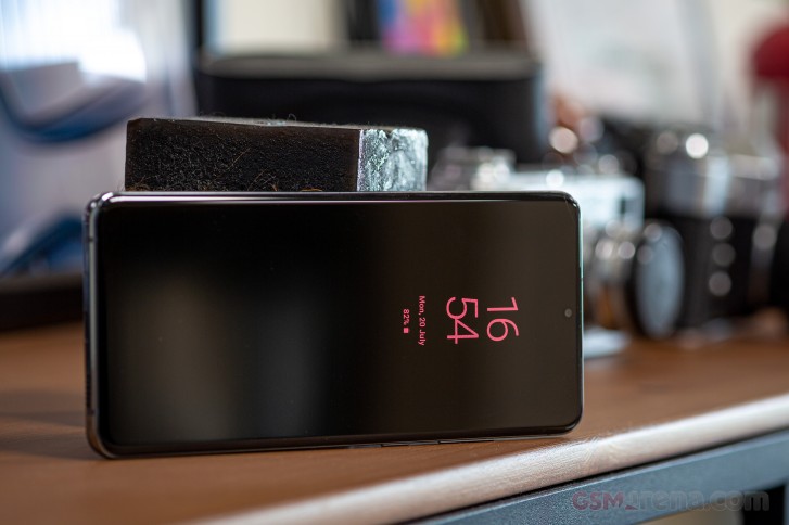
Anyway, enough ranting about age-old things that Samsung hasn't fixed - we'll have more on that in the software section. The S20 Ultra overall looks exactly as modern as a 2020 smartphone should, but its design is very 'safe'. There are no bells and whistles here, nothing incredibly out of the ordinary - unless you want to count the aforementioned camera island abomination, but we meant good out of the ordinary not bad out of the ordinary.
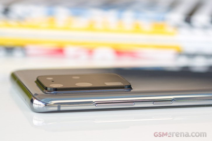
The Bixby key is gone (although Bixby itself still somehow survived), the phone is as slippery as you'd expect given the materials used for its construction, and it's obviously going to be very hard to use one-handed if you have small (or perhaps even average size) hands. We don't so we were fine with the extra screen real estate we were getting, as well as the extra battery capacity.


Bixby is alive and well
The design 'just works', on the front and sides at least, but it's really nothing revolutionary or that hasn't been done before, especially by Samsung. The centered hole-punch for the selfie camera makes this instantly recognizable as a recent Samsung device, as it's still the company churning out most of the handsets with such a design, and all of the AMOLEDs. Our conspiracy theory on the matter says Samsung Display is exclusively supplying Samsung Electronics with centered hole-punch AMOLED screens, at least for the time being. These exclusives do usually expire after a while, so don't be shocked to see other manufacturers getting similar designs in a few months or more. Just think of how Samsung did off-center hole punches first, and now every other company is - there's probably the same reason there.
Display
It's a huge Samsung-made AMOLED, so it is stunning. This is nothing unexpected, of course, for the company has consistently used the best screens out there with every flagship smartphone generation. Things are no different this time around, aside from one thing.
You probably already know this, but you can't use 120Hz refresh rate with the maximum resolution, it only works when the screen is set to 1080p+. This feels inexcusable on a device that costs this much. Sorry for not mincing words, but if Oppo and OnePlus can go QHD+ at 120Hz, then so should Samsung (who is most likely supplying the panels for the Find X2, X2 Pro, and OnePlus 8 Pro anyway). There's no escaping how weird it is for Samsung itself not to be able to pull this off on its signature device for early 2020.
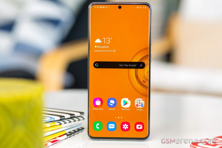
Also, it's been months since the S20 family was released. If this was all down to software, and QHD+ at 120Hz was possible to enable through a software update, it would have happened already. It's most likely a hardware bandwidth issue, which really shouldn't have passed muster during the prototyping phase.
Otherwise, the screen is outstanding. The brightness goes high enough that you have no issue making out what's on the display even in bright sunlight, and it goes low enough that the panel won't sear your retinas at night. There are two screen modes, Natural and Vivid, and a color slider to adjust from cool to warm. If you, like us, enjoy the 'Vivid' mode but want to 'tame' its color reproduction somewhat, a good tip is to just take that slider to the maximum Warm setting. This, for us, created a nice experience with colors that 'pop' (although unrealistically) but with whites that aren't comically blueish. Of course, if you want to see accurate (if blander) colors then go with the Natural setting.


Display settings
There's a blue light filter too which works very well and can be scheduled to automagically do its thing, and an Always On Display (also schedulable) with a bunch of clock styles to pick from. It also shows icons of the apps that you've received notifications from, and you can customize the color of the clock. It has widgets for music player controls, alarms, weather, and so on. There's not much more to say about it really, it just works and it works well, and we feel like it is adequately customizable for most people, while not going to extreme lengths to offer a bazillion different designs.


Always On Display settings
Auto-brightness works extremely well, at least for our taste, and the S20 Ultra was actually the second-best smartphone we've ever tested for a long-term review when it comes to how little we had to manually adjust the auto-brightness. The Huawei P40 Pro was better at this, but just by a tad. It's great to see manufacturers paying more attention to such user experience elements that may seem small, but here's the thing - if auto-brightness doesn't work well, it will frustrate you millions of times across the lifetime of the device. And that's not something any company should want its product to do to its customers.
In-display fingerprint sensor
Samsung still uses ultrasonic in-display fingerprint scanners, going against the grain in the mobile world, where literally every other company chose optical ones. The main downside with the optical sensors is that they need to light up your finger to unlock, and that can be slightly annoying in pitch dark environments.
The main downside with ultrasonic sensors, at least in Samsung's implementation of these, is that they just seem to be way less reliable and accurate than optical ones. They also used to feel slower, but thankfully that's something that you can 'fix' in the S20 Ultra by just turning off the unlocking animation (which Samsung calls "Screen transition effect") - it looks like that was the culprit and in the latest version of One UI you can finally get rid of it.


Biometrics and security settings
While in past long-term reviews we've praised some optical in-display fingerprint sensors for getting to a point where we can't subjectively tell any difference in reliability and accuracy between them and capacitive ones, the same can't be said for Samsung's ultrasonic part inside the Galaxy S20 Ultra. It definitely works... most of the time as expected, but then from time to time you will need to touch it again... or for longer. There's face unlocking on board too as you'd expect, but the usual caveat about that applies - it's less secure than using your fingerprint.
Smoothness
The screen section ties nicely into our innately subjective evaluation of smoothness in operation, because 120Hz is still as smooth as you can get with a 'mainstream' flagship smartphone and not one of the 'gaming' variety. Obviously, 120Hz is incredibly smooth, there's no contest there. We will mention however that in our experience, the jump from 60Hz to 90Hz feels more substantial than the one from 90Hz to 120Hz in use, but your mileage may obviously vary.
Now, the screen itself is smooth, but the overall user experience on the S20 Ultra is less so. That's because in our evaluation of smoothness, while display refresh rate does play a part, it's definitely not everything - the rest is up to the software, and how well optimized everything is on that front. And that's where the S20 Ultra falls flat on its face, compared to similarly priced 2020 flagships. The P40 Pro's software is actually smoother than the S20 Ultra's, and the likes of the Oppo Find X2 and X2 Pro pair that with 120Hz at QHD+ resolution, so unfortunately Samsung's latest and greatest misses the podium.
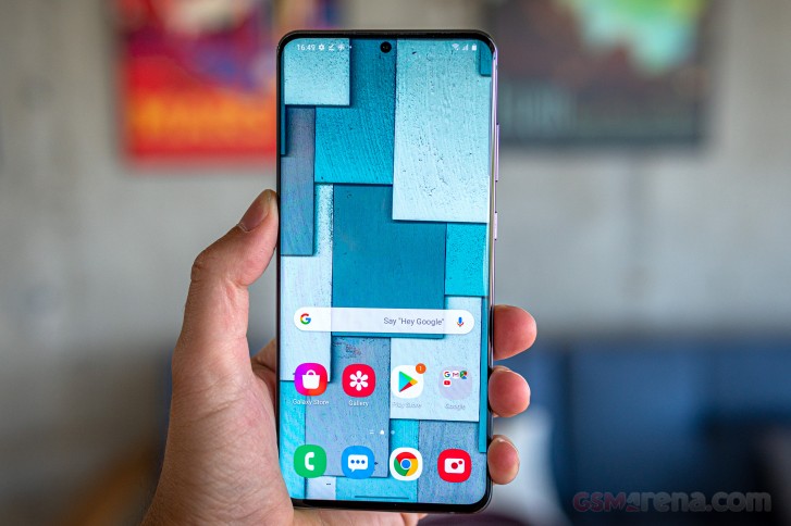
Obviously it's much smoother than any Samsung before it, and it's smoother than any 60Hz phone out there, but compared to other high refresh rate flagships, it suffers from the fact that Samsung still allows microstutters to be found everywhere when using its One UI, even in the 2.1 iteration. Things have improved a lot over the past few years in this regard, but we're still consistently baffled at how companies like OnePlus, Huawei, even Oppo and Xiaomi seem to all have a leg up here.
Bottom line then: the S20 Ultra is very smooth, especially compared to any other Samsung device that isn't part of the S20 line, but not an overall smoothness champ in our subjective book.
Performance
Smoothness aside, performance was excellent. The phone is incredibly fast no matter what you throw at it, and yes that's becoming a canned phrase in these reviews when we're discussing flagships, but that's what is expected. That's how it should be. Sure it may lag once in a while and stutter sometimes, but it is incredibly fast, almost to a point where its speed will spoil you and you'll be annoyed whenever you have to touch a friend's phone for even a few minutes - if it's a different model, of course.
It's a true flagship smartphone, and we expect the Snapdragon 865 model to be even faster than our Exynos-powered unit. So you should have absolutely no worries about performance, and also about it getting too warm in the hand when in use. Yes, if you throw the best games at it, you will feel it heating up, but nothing that gets to an uncomfortable point. This section isn't longer because there really isn't anything more to say, if you're interested in how the S20 Ultra does in synthetic benchmarks, make sure you read our normal review too, it's full of numbers.
One UI 2.1 based on Android 10
If we were to describe One UI 2.1 as seen on the Galaxy S20 Ultra in one word, it would be: busy. It's a very busy interface, in two ways.
First off, it just contains a million different settings and options for everything. It's probably the Android skin that gives you by far the most of these, and if that's your cup of tea, you'll love it. If, however, you're more in the "I just want things to work and not have to think about them" camp, well, you might be disappointed. Yes, it's great that you can nitpick almost anything to your liking, but this strategy also means Samsung can just spend less time thinking of what the ideal mode of interaction is, for any given setting. After all, hey, if the user doesn't like the default that's changeable. Well, yes, but every time such a change is required that in itself represents added friction, and that's not good user experience design. Good UX design stays out of your way as much as possible, and doesn't force you to change things just to get them to a more usable baseline.
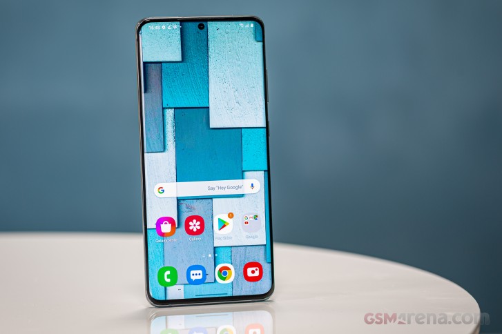
There are countless examples of this philosophy scattered throughout One UI 2.1. Why, for example, is the default setting to only show notification icons on the lock screen, and not the full notifications? The lock screen isn't the Always On Display, after all, is it? Sure, you can change this, of course. But why should you have to?


Notifications, Quick Settings, app switcher
The second meaning of "busy" in this UI is the design language itself. It just feels like it's not as clean, looks-wise, as a lot of its competitors in the Android realm (not to even bring iOS into the fold). The icons are definitely less cartoony than they used to be in TouchWiz days, but something about the entire design language just feels off to us, subjectively of course. If you don't feel the same, consider whether that may be because you've seen so many Samsung devices around that you're just more used to this. Being used to something, though, doesn't make it inherently good.
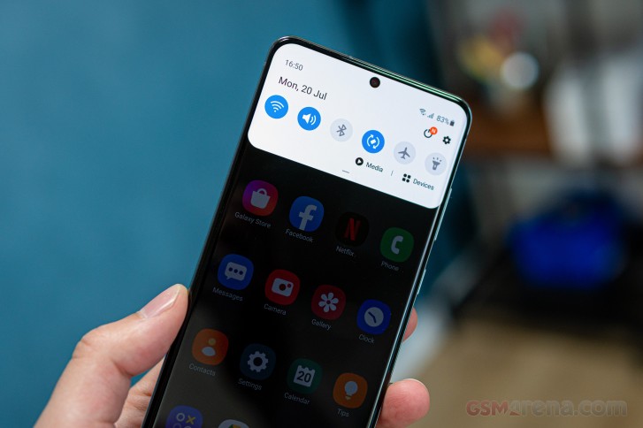
There's just a lot of stuff going on in One UI 2.1. Everywhere you look. Constantly. Okay, enough bashing. Let's turn to features.
Dark Mode, gesture navigation
Dark Mode is in there and it works well, just as it should. You can schedule it, but it doesn't force itself onto apps that don't have a dark mode. That would've been a nice feature to see, especially as it seems Facebook (for its main app) still hasn't gotten the memo about dark themes being a thing people like. And there are more apps like this, that would benefit from a forced inversion of their color scheme, to better fit in with the dark mode.
The gesture navigation is one of the most frustrating aspects about living with the S20 Ultra. If you're not a fan, and just go with buttons, then you can safely skip all of this annoyance.

Gesture settings
By now we're sure you know how things go in Android 10 when it comes to gestures. Swipe up from the bottom to go home, swipe up and hold for the multitasking menu, swipe inwards from the right or left side to go back. All of this is easy. But Samsung's One UI 2.1 does something that no other skin has ever done since gesture navigation was introduced.
Around 7 times out of 10 when swiping up to go home from an app, for a split second before the 'go home' action is triggered, the phone thinks we intended to scroll up inside whichever app we happened to be in. And so it does that. And the next time you go back into the app you'll be somewhere in the middle of the list - this is obviously worse with list-based UIs - you know, like Gmail, WhatsApp, Facebook Messenger, Messages, basically the most used apps on your phone. It's infuriating every single time it happens, and it happens dozens if not hundreds of times a day.
Why? Why can every other manufacturer sidestep this behavior but Samsung, with its mighty resources, can't? Who knows. Do keep this in mind though if, like us, once you started using gestures you couldn't go back to the three-button navigation bar. The S20 Ultra has this... let's call it a quirk, although it's clearly a very obvious bug that has gone unnoticed for months.
Launcher, settings
Samsung's launcher has an app drawer, which is great, but the app drawer is still scrolling horizontally, and that still breaks the interaction model. You swipe up to bring up the app drawer, you're then naturally inclined to keep swiping up to scroll through it. But no. Go sideways. There are still folders in the app drawer and the default sorting still isn't by name. You know, like most other app drawers. Because of how most (but not all) Google apps are in the Google folder, if you are hunting for a specific app, setting the drawer to order by name may not be useful after all, because folders are always shown first. Why? Why are there folders, by default, in the app drawer? Who knows.
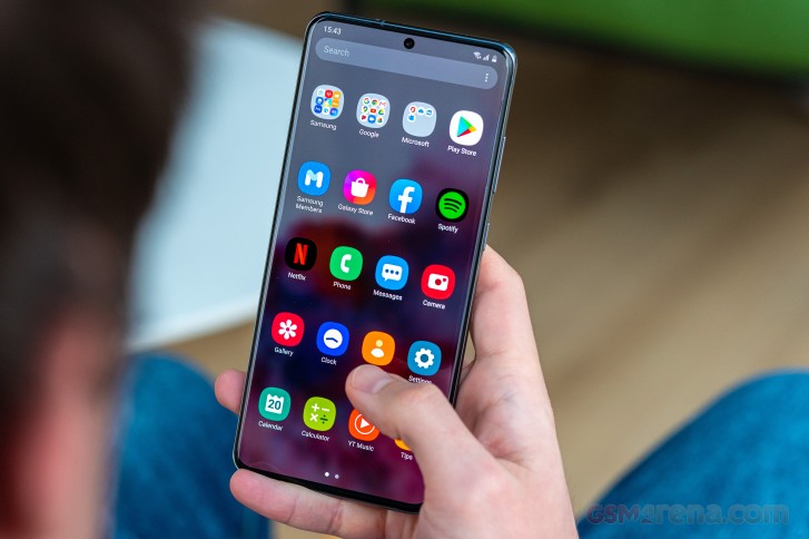
Oh, wait, maybe that's not so hard to get to the bottom of. And it might have to do with bloatware and duplicate apps, two long standing hobbies of Samsung's. Both are still very much alive and well in this hugely expensive 2020 phone. Maybe if there weren't so many preinstalled apps there would be no need to sort them into folders in the app drawer. We'll probably never know, because Samsung seems intent on continuing to pursue its strategy of duplicating everything Google does, but making most of those duplicate apps and services somehow worse. And then there's also Samsung's partnership with Microsoft, which means you now have preinstalled bloatware on your handset, right out of the box, from three different sources: Google, Samsung, and Microsoft.
Of course you can just ignore all of those apps, and the S20 Ultra has ample storage so you won't ever run low on that because of the bloat. You can even disable the apps you don't like, and some are actually uninstallable. But why would you need to go through that - how is this a great out-of-the-box experience?
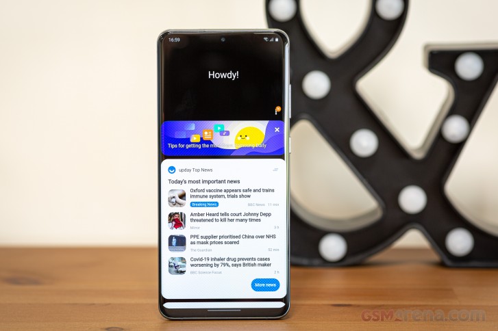
To the left of your leftmost home screen sits the laggiest, stutteriest bit of the entire software experience. Its name is Samsung Daily, previously known as Bixby Home. It takes a good 2-3 seconds to launch, and then every scrolling interaction with it is a stuttering mess. Why does anything this badly coded exist on a device this premium? Who knows. The only purpose of its existence seems to be to duplicate the features of Google's Feed (or whatever it's called this week). And yet - you probably saw this coming - it's inferior to that in every way. But you don't get the option to add the Google Feed to the built-in Samsung launcher, so you're left with either struggling with the inferior option or just ignoring it altogether.


Samsung Daily, launcher and app drawer
The Settings menu, if printed, would probably stretch across the equator, at least once if not twice. It's one of the most convoluted Settings menus you can find in the mobile world right now, but that's because of the sheer amount of stuff it has to house. We're exaggerating when we say there's literally an option in there for anything you can think to customize on the phone, but we're only exaggerating by very little. It feels like if you can think it, it's there, waiting for you to tinker.


Settings
That's great, but we're willing to wager that most people, over the 2-3 years they'd be using the S20 Ultra, wouldn't be exposed to more than 10% of the Settings menu. Most people don't want to spend 8 hours hunting through every Settings sub-sub-sub-menu to see what's there. Most people just want their devices to work, and to do so in a way that's intuitive and familiar.
The experience on the S20 Ultra will definitely be familiar to you if you're upgrading to it from another Samsung smartphone, regardless of whether it runs an older version of One UI or Samsung Experience that came before. And given Samsung's huge installed user base, this is very important. But as much as that feeling of familiarity is there in such a scenario, if you switch from almost any other smartphone, you may feel overwhelmed by all of the settings and nooks and crannies and knobs.
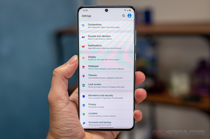
The number of options would be fine if all of their default behaviors would intuitively make sense - being similar to how things are done on other skins - but that's not the case. And so, given that the average user doesn't have the tendency to dive into Settings menus on a constant basis to fix weird default behavior, it's likely that said average user would forever (for the life of the S20 Ultra) be stuck with the icons-only on the lock screen situation described above, and be frustrated by it every single time the screen comes on.
Updates
Samsung has been amazing with security updates recently, especially for its flagship line of devices. Case in point: we received the July security update before even Google rolled it out to its Pixels. And this was no oddball occurrence either, Samsung has pretty much figured out how to be incredibly timely with security patches, and for that we commend the company.


Current software
It's also gotten way better at big Android updates, and while these still take a few months to arrive on a flagship Galaxy, the amount of time that this takes after Google releases a new iteration has decreased with every passing year. So based on this, we're hopeful that the Galaxy S20 Ultra will be on Android 11 before the end of this year. Perhaps even weeks before, but that's just wishful thinking on our part. Still, the point is that while Samsung still isn't the fastest with big updates, it definitely isn't among the slowest anymore, and that's great to see.
Battery life
The S20 Ultra's endurance has been way less impressive than the 5,000 mAh number would lead one to believe it would be. Based on the capacity alone, we were expecting it to easily have managed over two days of usage on one charge, but no, in fact we had to top up the phone every night. Sometimes we'd finish a day with 20+% left, sometimes with much less, but almost never with more, unless we had a day in which we didn't use it almost at all.
We usually give you screen on time numbers in long-term reviews, to get an idea of what to expect if your use scenario is similar to ours, but in this case there's a wrinkle, and that's the way that Samsung's software reports battery usage. See, most other skins tell you how long it's been since the last full charge, and how much screen usage you've had since then. Samsung wanted to be different, and thus it tells you how many hours of screen on time you had each day. As in, each calendar day. This is obviously discriminatory towards people like this reviewer who are 'night owls', going to sleep in the early AMs, because now the screen time for a calendar day is partly from before a full charge (while sleeping), partly after.
With this mess in mind, note that we were able to achieve over 5 hours of screen on time on almost all days, with our usage based primarily on Wi-Fi connectivity, with around an hour on 5G, an hour or two of phone calls, Bluetooth always on, around an hour of music streaming, and 30 minutes to an hour of GPS navigation.


Battery life
Speaking of GPS, for some reason the S20 Ultra seemed to very much enjoy eating up the battery when in navigation mode (we use Waze or Google Maps). And we mean much more (subjectively) than other devices, this sort of reminds us of the situation many years back when GPS chips were highly inefficient. We're not sure what's going on here - maybe the GPS locator chip isn't the best at sipping battery, or something about it having to work alongside the screen being on and an active data connection that creates this feeling, but do be prepared to have a charger in the car if you use navigation a lot.
Speaking of charging, the S20 Ultra, despite its price, comes with a measly 25W charger in the box, although Samsung will gladly take more of your money for a 45W brick that doesn't actually speed up charging all that much. This is... baffling, quite honestly. We found the charging time on the default brick from 0 to 100 to be reasonably decent at just over an hour, but far from record breaking. And of course you also have wireless charging for some added flexibility, although that too is anything but the fastest around these days.
Camera
Time to find out if the huge unsightly camera hump was worth it. As in, is there enough quality in there to warrant its size and looks? To make you look past them, even? Well, spoiler alert: yes, but with a couple of huge caveats.
First off, because of the sheer size of the main snapper's sensor, paired with the very bright aperture, it's great at creating some dose of 'natural' bokeh even if you don't employ the dedicated mode for that. Just point and shoot and you're getting more bokeh in auto mode than on any other phone.
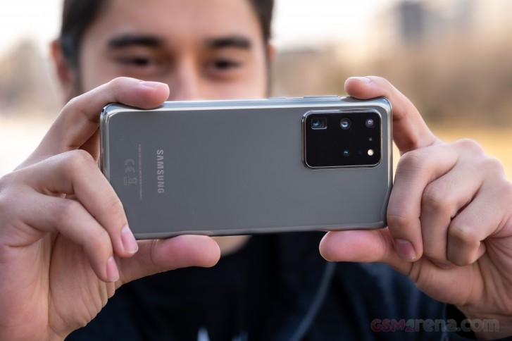
This can of course be great if that's what you're after, but here's the thing: the focus plane is quite small, probably the smallest for any flagship smartphone, and so if you're shooting a big object that covers most of the frame, some of that is going to be in focus (in the middle), and some of it (to the sides) will not. There's no way around this, you can't just change a setting and mitigate it, because it's a physical hardware thing, not a software setting. Again, this works amazingly for some shots, and very much not amazingly on others. It's a thing to keep in mind, and it unfortunately means that you can't trust the S20 Ultra to get every shot right, every time. If you don't like out of focus edges, you will have to think about framing more than with any other smartphone. Or use one of the other cameras on the rear, of course.
Secondly, the S20 Ultra still, after many camera-improving updates, has issues focusing with its main sensor. Both auto-focus and manual focus, it goes focus hunting a lot more than any recent flagship we've seen, and it randomly tends to lose focus, and then go hunting again. The hunting itself rarely takes over 1 or 2 seconds, but the sheer fact that this is a thing and happens this much reminds us of top of the line smartphones from quite a few years ago, or even lower priced devices from back when focusing wasn't a solved problem on smartphones. In the meantime, it totally has been, until Samsung made it an issue again on the S20 Ultra.
And that's a real shame, because when it does focus, the main camera does churn out some incredibly impressive pictures - if you don't mind the narrow focus plane. And yet - this is not an ideal user experience, and the focus hunting gets especially bad when shooting video. We're not quite sure how Samsung's product planning department decided to let this slide, for a device that's this premium and comes with such a high price tag. The camera quality itself may be outstanding (as you'll see), but the experience of using the S20 Ultra's main camera is trumped by basically all of its competitors.
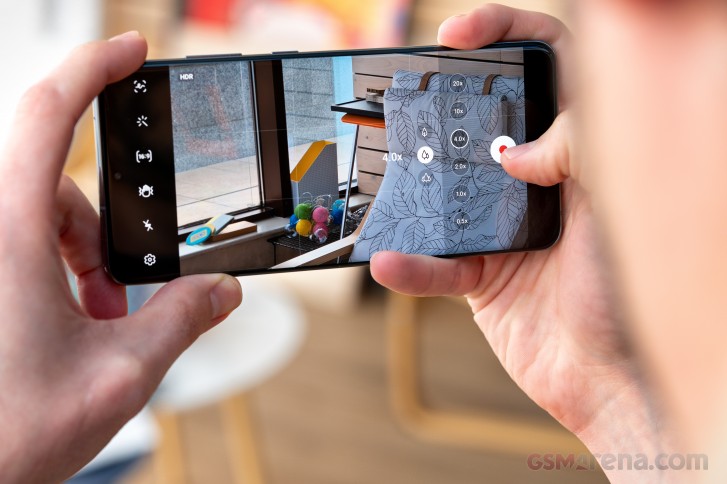
The camera app is the standard Samsung fare, and it looks very similar to every camera app out there at this point. The one weird thing about it is that things such as Night mode and Live focus (aka Portrait Mode) aren't in the main carousel of shooting modes, you have to go into the More submenu to find them. There is, thankfully, a way in Settings to make these part of the main carousel of options, but why they're not there in the first place is beyond us. The app is easy enough to use otherwise, although in Night mode it has a quirky animation that 'fills up' the shutter button on screen as the timer goes down - that's all fine and dandy, except the bubble always gets filled up before the countdown actually expires. This threw us off the first few times, then we just learned to live with it, but more attention to such details wouldn't have hurt.
As mentioned above, the S20 Ultra's main cam produces stunning images in broad daylight. Note that as usual in long-term reviews we're going with Auto-mode here, which spits out pixel-binned 12 MP images. The quality is definitely great, with practically no noise, and very good dynamic range. It's all what you'd expect from such a top of the line device, and while the colors do 'pop' more than they do in real life, they don't go overboard, at least for our taste. If you dig natural accurate looks, though, you're probably not looking into a Samsung smartphone anyway.


Daytime samples from the main camera
The ultrawide is very good too, with similarly punchy colors and good dynamic range, if lacking in detail somewhat. Then again, that's pretty much the case with all ultrawides, with some notable exceptions on the Huawei and Apple sides of the fence. It's also properly wide, unlike some competitors. Sadly though it doesn't have autofocus which for a top tier handset is a very weird oversight. Edge distortion is corrected very well.


Daytime samples from the ultrawide
The S20 Ultra's periscope zoom camera does about 4x optical zoom, but confusingly the 'zoom' setting in the camera app takes you to 5x, which is a hybrid zoom. With this in mind, we decided to do things differently than usual, and not go with the default settings here. Instead, we manually chose 4x and also tested 10x hybrid zoom to see if those shots are usable. Spoiler alert: they are, very much so, especially for social media use.


Daytime samples, 4x zoom
The 4x shots come with excellent detail, no noise, nice colors, high contrast, and pleasantly wide dynamic range. The 10x images are understandably less impressive. Sharpness and detail levels are still decent, though.


Daytime samples, 10x zoom
We shot a few of 100x "Space Zoom" photos just to show that there definitely wasn't any need for this bombastic marketing. Maybe if you really really have to use them, they'll do just fine, but even on the phone's screen they just plain look bad. It's great to see that we have a slider going up to a crazy 100x on a phone, perhaps, yay innovation and all that. But this is just not something you will use more than once or twice a month, or less.


Daytime samples, 100x zoom
The huge sensor of the main cam did make us expect amazing night time shots, and it did not disappoint. These are excellent images, with good levels of detail and noise that is handled very well. Color rendition is on point, with some 'pop' even - a rare feat for nighttime shots in general. Dynamic range is good too, and you can improve it with Night mode of course.


Nighttime samples, main camera
If you choose to go this route, the highlights will be reigned in, the shadows lit up, while colors are saturated even more. Expect practically no noise in this mode. It does take a while to capture Night mode pictures, and the Auto mode ones at night are so good already that you may find yourself skipping on Night mode quite often.


Night mode samples, main camera
The ultrawide at night is obviously not in the same league as the main shooter, but it does hold its own, at least compared to some other efforts we've seen. It manages to show decent amounts of detail, especially where you have some light sources around, and the dynamic range is also decent for an ultrawide. That said, when there's practically no light around your shot, things get very dark very fast.


Nighttime samples, ultrawide
Night mode lifts the shadows here too, and amps up the dynamic range as a consequence, while the highlights are retained somewhat better and the colors boosted. You also get less noise but at the cost of some added softness.


Night mode samples, ultrawide
Zoom at night produces pleasing images at 4x, with good detail levels, color rendition, and dynamic range.





Nighttime samples, 4x zoom
When you add Night mode to 4x shots, they're pretty much universally made better, at the cost of each snap taking a while. You also lose some sharpness, but gain punchier colors, boosted shadows, and better highlights - yeah, this is a theme with Samsung's Night mode on all cameras on offer here.


Night mode samples, 4x zoom
10x shots at night are, most of the time, practically unusable, unless you're really lucky, so we wouldn't go that far on the magnification slider unless our life depended on it. These are the best shots we captured with this setting, but countless others had to be discarded.







Nighttime samples, 10x zoom
Selfies during the day are generally very good, with great levels of detail, nice and punchy colors, and excellent dynamic range. Live focus (aka Portrait mode in Samsung parlance) is good most of the time, even if sometimes it does go crazy with misinterpreting what's going on in the bordering regions of subject separation.


Daytime selfies, Live focus (aka Portrait mode) off/on
At night the selfie quality drops significantly, which isn't unexpected at all - this is pretty much par for the course for all selfie cams, especially when you're not using a 'screen flash' feature. We weren't here, just to show you how bad things get when there's barely any light around, and how passable the selfies get when you are at least close to a light source.


Nighttime selfies, Live focus (aka Portrait mode) off/on
Overall, the Galaxy S20 Ultra has a very capable camera system, both front and back, which is not perfect because of a few issues. The ultrawide isn't the best out there, and the main camera, while very interesting as a technological accomplishment in its own right, unfortunately just doesn't provide a perfect user experience because of its focusing issues - even if the shots it produces are very good, perhaps among the best out there at the moment.
Conclusion
This is pretty much billed as the everything phone. And for its asking price, the Galaxy S20 Ultra should have been perfect. Ultra perfect, even. Unfortunately, it just isn't. And we don't simply mean this in the "no one device is perfect for everyone" way. There are things that are objectively worse about the experience of using this phone than others that cost (way) less. And that's simply unacceptable.
The resolution limitation for when you want to use 120Hz refresh rate, the focus hunting on the main camera, the completely irritating 'going home' gesture bug, all of these are things that you won't get on any competing device. Not on ones that are more expensive, not on ones that are slightly cheaper, not on ones that cost one third of the price.
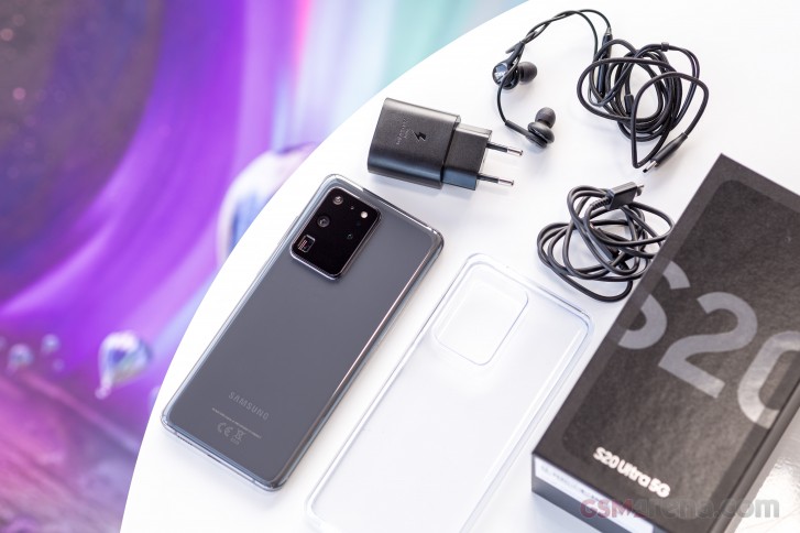
The S20 Ultra is the phone incarnation of the concept of "bragging rights". You buy this one to get exactly that. You don't buy it to have what was, up until now, a given - a great focusing experience with the main cam. You don't buy this one for doing everything at the same time - you pick and choose because some options aren't compatible with each other. You don't buy this because it gives you a very headache-free experience when using it. No, the S20 Ultra screams that it wants to brag and you buy it to let it do just that.
It focuses so much on bragging, in fact, that it misses some of the basics of what makes a smartphone amazing in day to day life. It seems very proud of the ridiculous "100X Space Zoom" inscription, even if the 100X zoom is completely useless for 99% of people 99% of the time. It doesn't care. It shouts at you: "100X! Space Zoom, bro!". "Can your phone do 100X? No it can't!" It's irrelevant how irrelevant that 'feature' actually is in daily use, the point is just to have it, and then brag that it's there.
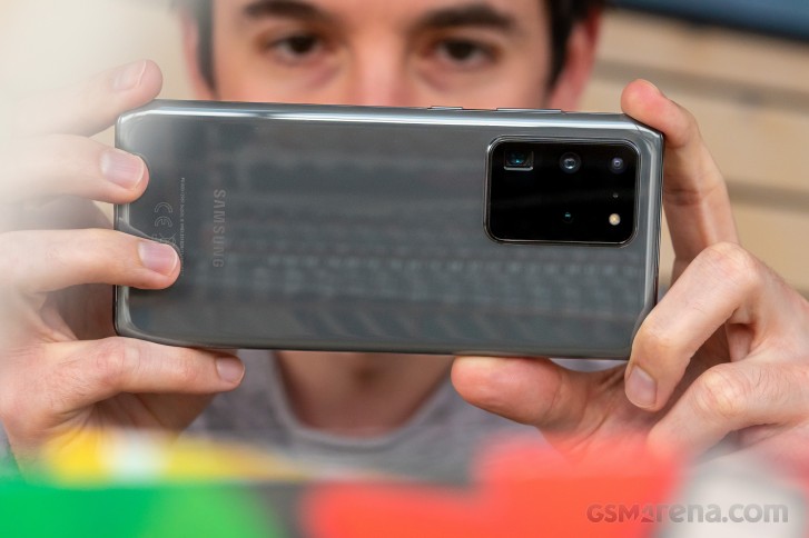
Sure, it might have by far the ugliest camera island design on the back, but that's not the point, since it also happens to be among the bigger ones out there, if not the biggest. And that seems to have been much more important during the design process than the looks. The screen is also, coincidentally or not, among the biggest on anything that can reasonably be called a 'mainstream' flagship smartphone. Unashamedly so. And yet when you ask of it to do both 120 Hz and QHD+ resolution at the same time, it won't. But it has the bigness going for it, that's for sure, and also, in fairness, the sheer panel quality - which is matched by other phones, but not beaten. At least not until the Note20 family launches.
The S20 Ultra has a flatter screen than previous generations of Samsung flagships because that somehow made more sense than simply having a good software algorithm to recognize (and ignore) accidental touches. Most of its competitors, some of them actually using Samsung panels, have figured this out.
This device is bigger, badder, and, dare we say it, shouty-er than anything that came before it. It's the GO BIG OR GO HOME phone, it's the one you get if a truck (by the American definition) is your idea of an average car. The S20 Ultra will pair incredibly well with that. Come to think of it, this is pretty much the truck of smartphones, actually, the quintessential 'size trumps everything else' device. Its design language and UX both seem to want to talk to you IN CAPS LOCK. ALL THE TIME.
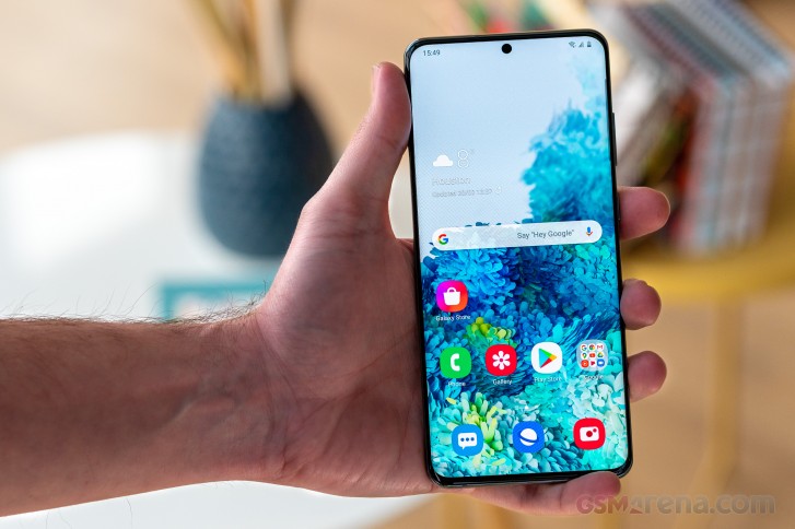
It's a great flawed smartphone, though. For the right audience, for the people who value all of the above above all else, it even has the potential to be perfectly flawed. There's always a market for everything, and if you hate colorful phone backs, then you'll love this big chunk of blandness that screams at you everytime you ask it a reasonable question. That's its MO. It screams, it shouts, it talks at you, it talks past you, it is constantly reminding you of how superior it is to everything else out there. Because that way perhaps it will be able to keep you constantly distracted, so you don't notice its glaring idiosyncrasies. You may pay for it, but you don't own this phone. The S20 Ultra is the phone that owns you, forcing you to constantly re-rationalize why you got it in the first place. It's the best of everything, in your mind, because it has to be. After all, you spent a huge chunk of money on it.
And look, a lot of that is warranted, don't get us wrong. We're not picking on the S20 Ultra because it's bad, we're picking on it because while very good, it narrowly misses out on being 'the one'. The one to instantly recommend by default to anyone looking for a top dollar Android device. We just can't do that without a few caveats, unfortunately: "if money is no issue", "if you don't mind the focusing problems", "if you don't care about having high refresh rate and max resolution at the same time", "if you're willing to live with good but not amazing battery life", "if you don't mind UI stutters here and there", "if you don't mind the clutter of the UI's design language", "if you can live with tons of duplicate apps and services without getting confused".
So, if you ticked all those boxes, this is the phone for you. Otherwise, you may be better served looking elsewhere. A good place to start would be the Samsung Galaxy S20+, which shares the S20 Ultra's software quirks, but is cheaper. We heard rumors that the Note20 line would fix the focusing issues, so that might be an option too. If you do go with the S20 Ultra, we hope that this review has been helpful in letting you know what to expect. Of course none of these things may be important to you personally - we get that. But for people who have 'deal breakers', these are the only ones. Otherwise, the S20 Ultra is a true 2020 flagship.
tinyurlis.gdv.gdv.htclck.ruulvis.netshrtco.detny.im
